Brand design
Brand · Design


We design brand identities for organizations whose brand no longer reflects the work they do. We start with what the organization is and who needs to understand it, and we often go on to build the website the new identity lives on.
A brand that had fallen behind the work
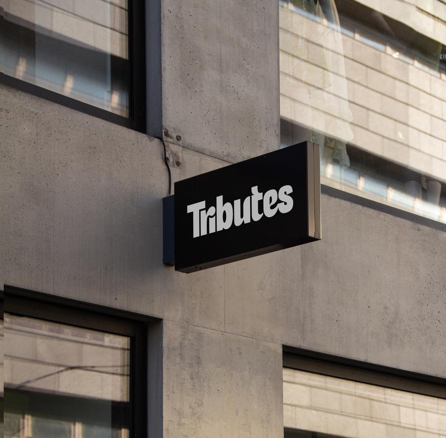
Tributes came to us worried that the vibrant, technically capable work happening on their shop floor was not reflected in how the brand presented itself. We built the identity around a vivid blue, the colour of printing ink, with screen-print textures and a ripped-paper look that point back to how they make things. The identity was finished in late 2024 and set up the website that followed.
Tributes' brand identity
A mark with movement in it, designed for the bags, shirts and merchandise it would end up printed on.

A refresh, then a website
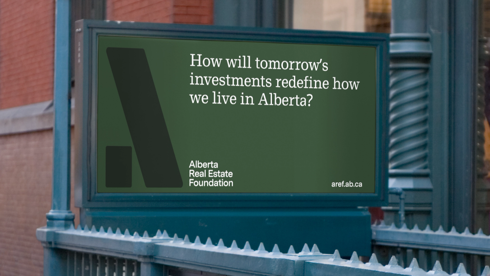
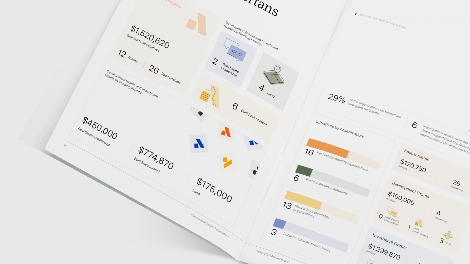
Alberta Real Estate Foundation wanted an identity that matched its forward-looking mission. We refreshed the logo and wordmark, the colour palette and the typography, wrote brand guidelines, and then redesigned and rebuilt their website on the new brand. Executive Director Patti Morris said we "took the time to deeply understand our mission and audience."
One site for two organizations
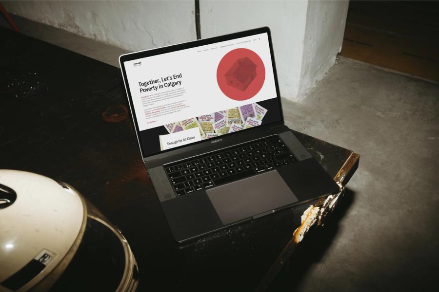
Vibrant Communities Calgary ran two websites, one for themselves and one for Enough for All, Calgary's poverty reduction strategy, and visitors could not tell how the two organizations related. Vibrant Communities had a logo but little visual language beyond it, so we built one, with type, colour and layout rules and a set of halftone icons for the Levers of Change, such as Housing and Food Security. The visual system and a new content structure launched together as one site in early 2021.
Enough for All
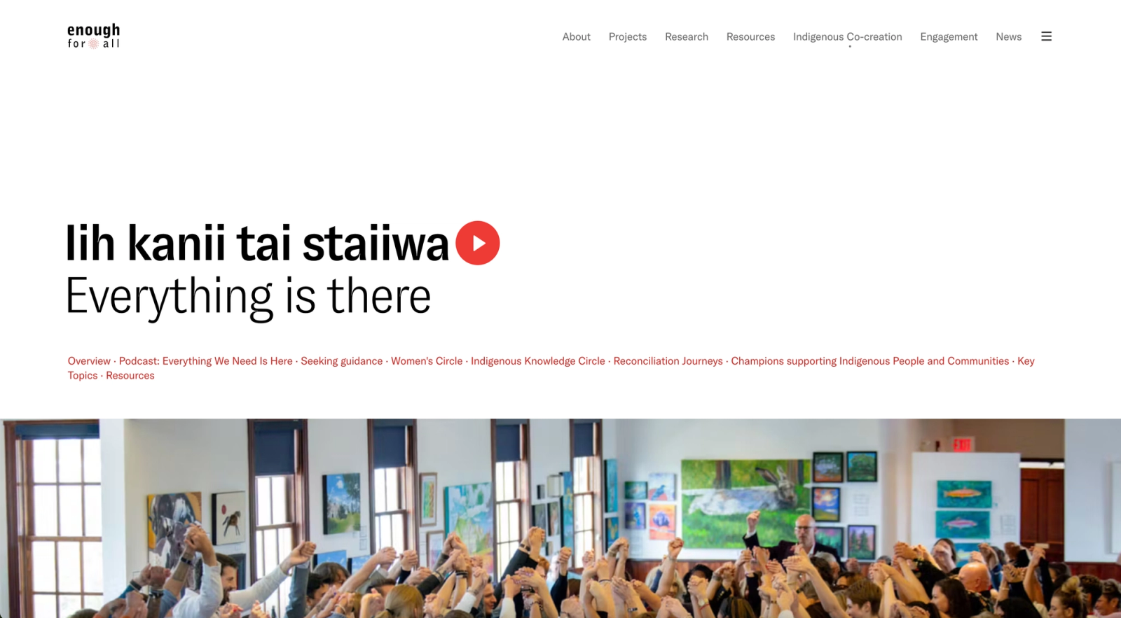
One site for Vibrant Communities Calgary and Enough for All, with an icon for each of the Levers of Change.
Where we start
Before any logo, we work out what the organization is, who needs to understand it and everywhere the identity will appear. The visual work follows from those answers.
Selected work
Show more2025
2025
Strata Capital Partners Brand Direction
Brand design, Visual identity
Brand design, Visual identity
2025
2025
Calgary Arts Development Calgary Public Art Guide identity
Visual identity, Brand design
Visual identity, Brand design
2023–2024

Brand design, Visual identity
2022–2023

Brand design, Visual identity
