Web design
Web · Design
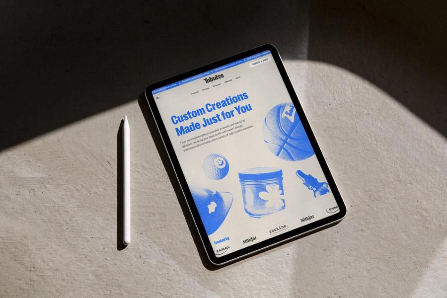
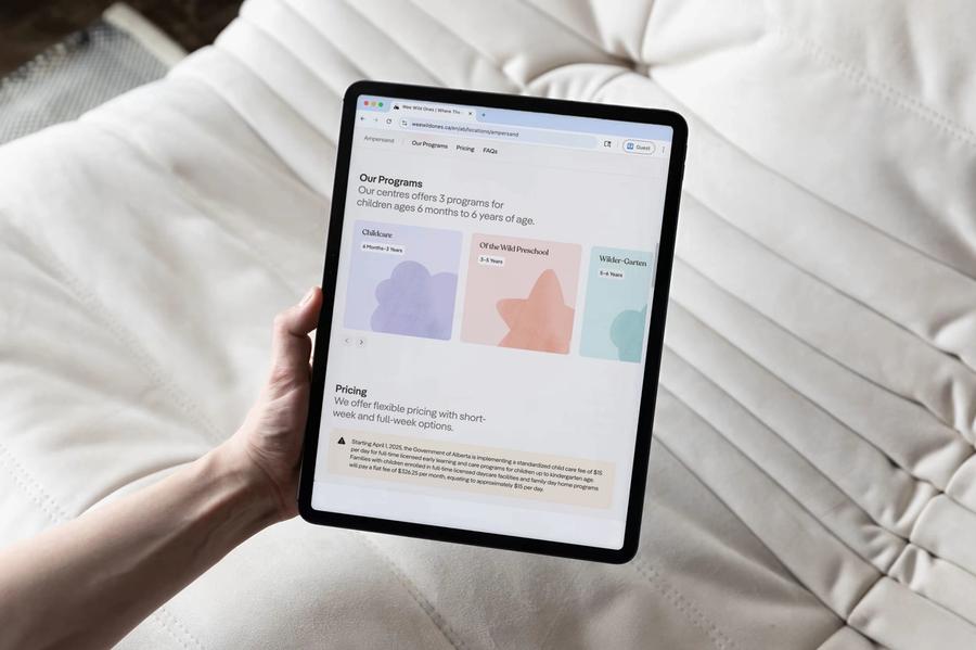
We design websites for organizations that have outgrown their current site or whose site no longer reflects the quality of their work. We work out the content structure first, and the people who draw the pages are the people who build them.
Momentum's courses
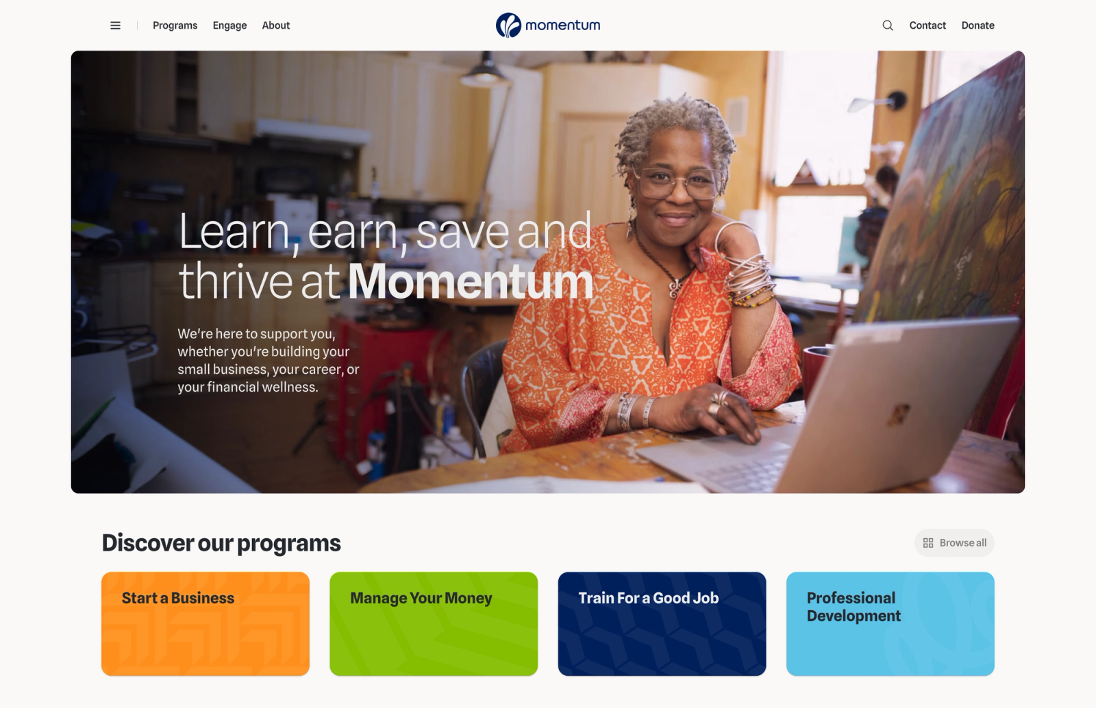
Organizations often ask for a redesign when their site stops matching how they work, and that was Momentum's situation. They had grown since their first site, several new courses had launched with different structures, and signup worked differently from one course to the next. It was not always clear which pages were courses.
We audited their content and modelled every course and program as structured content, so each program builds its own page. With every course in the same shape, the design had something consistent to work with. The site is bright and welcoming, and plain enough that pages dense with information stay easy to navigate. Years after launch, Momentum still gets compliments on it.
Momentum's organization website
Course and program pages built from one content model, so every course has the same shape.
Navigation for educators, teens and funders
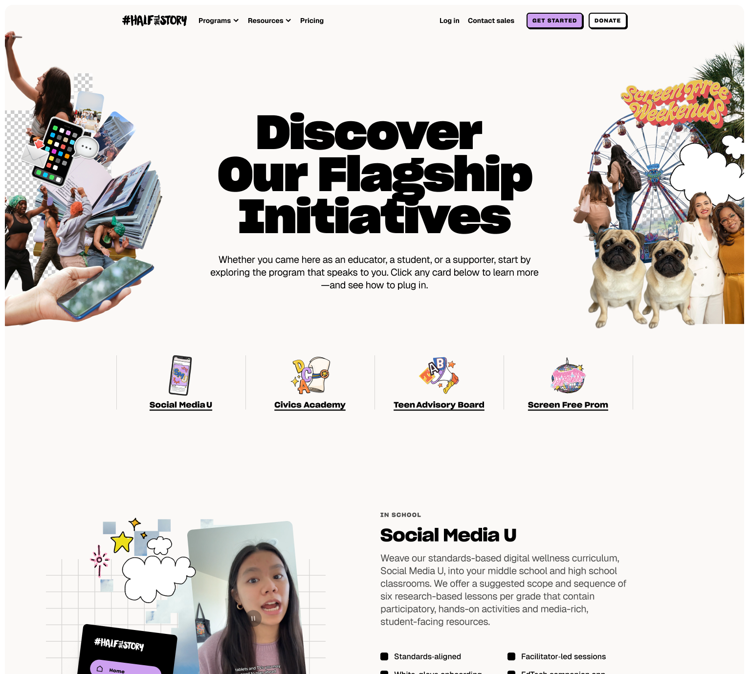
#HalfTheStory had a site built for a smaller version of the organization. Every new program meant new design work, and the paths through the site treated every visitor the same.
Educators, teens and funders come to the site needing different things. A program-first navigation suits search and the brand, but a teacher who does not know the programs by name may not know where to start. We kept the primary navigation program-first and grouped the programs into audience dropdowns underneath. Calls to action change with context, so an educator reading a program page is offered classroom resources instead of a general contact form.
Sites with a lot of content
Foundations, non-profits and public agencies publish more than most businesses, from grants and programs to annual reports, board biographies and policies. It is tempting to give each section its own look, but then the reader has to learn a new layout every few pages.
We keep to one type scale and a small set of layouts, and let the hierarchy do the work that decoration would otherwise do. The Alberta Real Estate Foundation's site is built this way, and it holds the thousands of documents, pages and resources we migrated from their old site. Readers learn the pattern once and can find their way through the rest.
Alberta Real Estate Foundation
Thousands of documents and resources, laid out with a small set of repeating layouts.

Drawn by the people who build it
The same people design and build these sites, so there is no handoff, and we do not draw what we cannot build.
We test layouts against real content from the CMS rather than placeholder text, so a headline that only works at eight words gets caught while it is still cheap to change. We prototype motion in code, where the timing can be tried rather than guessed. Type scales and spacing are set up as tokens that the build uses directly.
Selected work
Show more2025–2026
2025–2026
Rise Calgary Website
Web design, Web development, Content management systems, Content modelling
Web design, Web development, Content management systems, Content modelling
2023–2026
2023–2026
SLS Centre Website
Web design, Web development
Web design, Web development
2026
2026
Calgary Municipal Land Corporation Transit-Oriented Communities
Web design, Web development, Brand implementation, Information architecture, Content modelling, Interaction design
Web design, Web development, Brand implementation, Information architecture, Content modelling, Interaction design
2025–2026
2025–2026
Strata Capital Partners Company Website
Web design, Web development, Content management systems, Information architecture, Content strategy
Web design, Web development, Content management systems, Information architecture, Content strategy
2025–2026

Web design, Web development, Content management systems, Content modelling
All capabilities
Brand
Structure
Web
Design
- Web design
- Editorial design
- Accessible design