Visual identity
Brand · Design
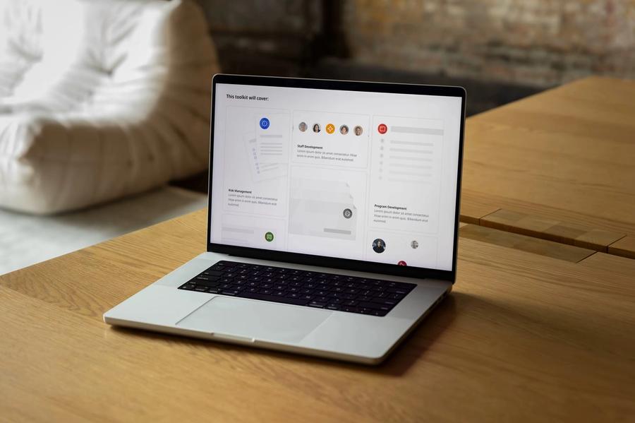

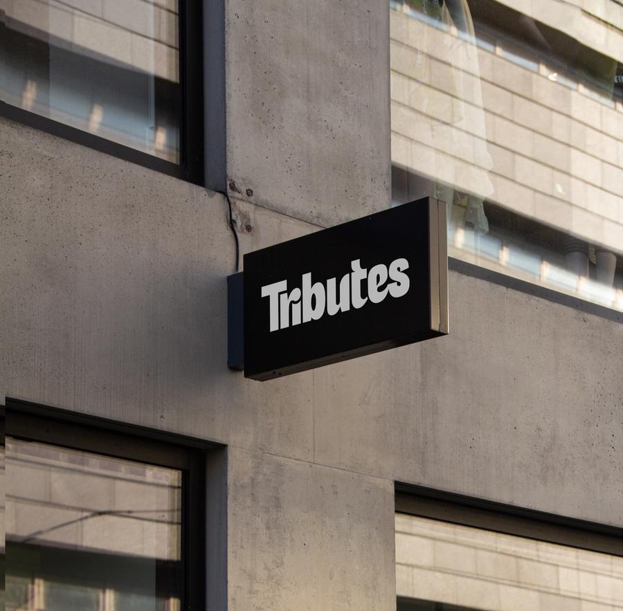

We design the logo, colour and type of a brand as one system, then mock it up on real applications, from business cards to web pages, before we hand it over.
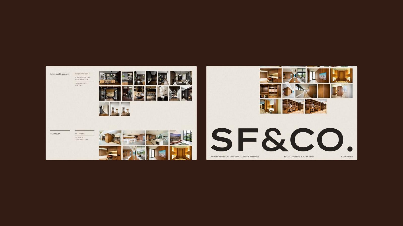
Shaun Ford & Co's ampersand
Shaun Ford & Co already had a logo they trusted when they came to us in 2022, and they wanted clarity about where the brand could go next. The ampersand was already the focal point, so after exploring a few directions we tightened what was working instead of replacing it. The colour palette grew from their portfolio of interiors, which tend toward earthy, muted tones.
Shaun Ford & Co
The refined ampersand, with previews on business cards, letterhead and desktop and mobile screens.
Ava Industries' name and logomark
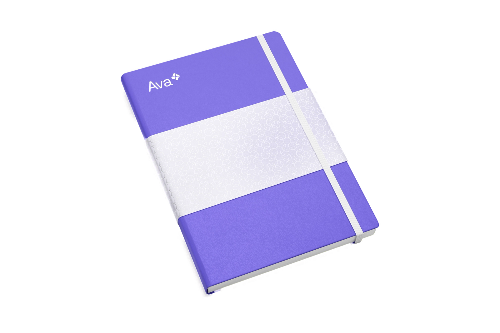
Ava Industries' tagline, "created by doctors, for doctors", already carried the strategy, so our job was to make it readable in the identity too. We set the name in title case instead of all capitals, which makes it feel approachable. The logomark is a spiral of abstract forms in shades of the brand's purple, suggesting patient records that are always in use, and each brand colour has a full tonal scale so the system holds together in a marketing deck or a clinical interface.
Ava Industries
Ava's spiral logomark in the brand's purple, drawn in horizontal and vertical versions.
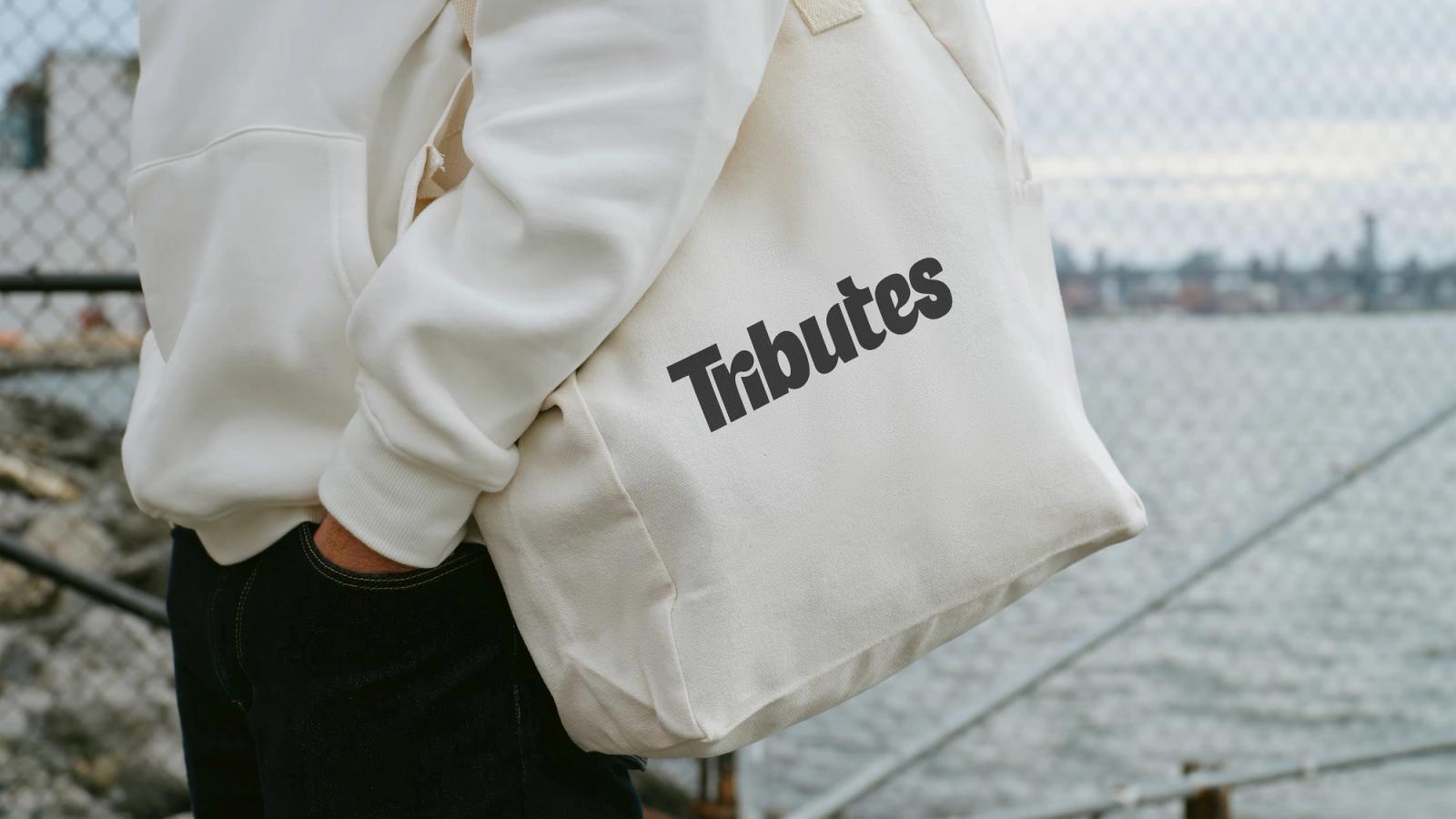
Designed for what Tributes prints on
Tributes prints and engraves products for a living, so their logo had to look good printed on bags, shirts and merchandise as well as on a screen. We designed a mark with movement in it, welcoming and a little unconventional.
Our guidelines cover how each part of an identity behaves as well as how it looks, so the client's team can apply it without us. Springboard Performance's mark, for example, is black and white by default and takes its colour from the event photography beside it.

Selected work
Show more2026
2026
Alberta Real Estate Foundation 35th Anniversary Assets
Brand implementation, Visual identity
Brand implementation, Visual identity
2025–2026
2025–2026
University of Calgary Alberta Post-Secondary Global Learning Toolkit
Platforms and applications, Portals and member experiences, Content management systems, Interface design, Visual identity, Brand implementation

Platforms and applications, Portals and member experiences, Content management systems, Interface design, Visual identity, Brand implementation
2025
2025
Strata Capital Partners Brand Direction
Brand design, Visual identity
Brand design, Visual identity
2025
2025
Calgary Arts Development Calgary Public Art Guide identity
Visual identity, Brand design
Visual identity, Brand design
2023–2024

Brand design, Visual identity