

Shaun Ford & Co · Brand identity
Modernizing a brand identity without losing what made it theirs

When Shaun Ford & Co. came to Built by Field in 2022, they already had a logo they trusted, but they needed clarity on where the brand could go from there. The ampersand was already their logo's focal point, so after exploring a few possible directions, we landed on refinement rather than reinvention, tightening what was already working rather than replacing it. That decision set the tone for everything that followed.
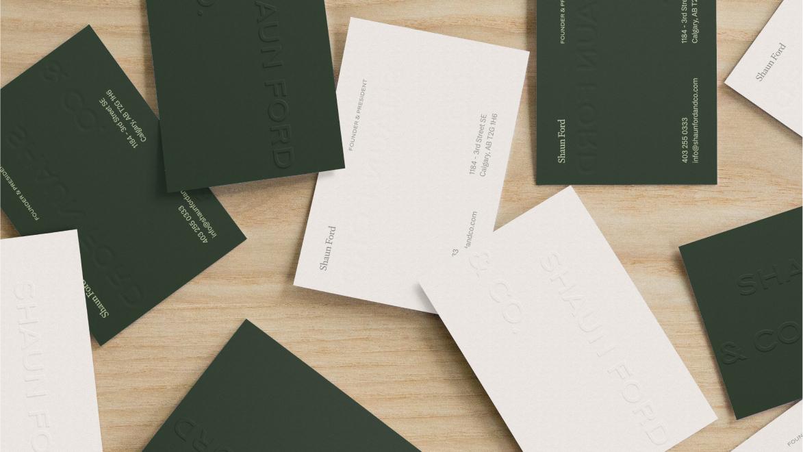

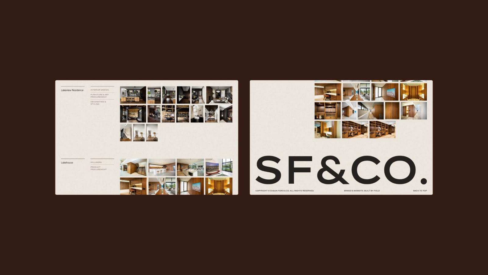
The colour palette grew directly from their portfolio. Their interiors are often earthy, muted tones: warm without feeling too heavy, considered without coming across as cold. We used that existing sensibility as our starting point, building a colour system to add warmth at the brand level without pulling the identity away from the character of the work itself.
To give the Shaun Ford & Co. team a clear picture of how this identity could carry across contexts, we developed a series of previews spanning digital and physical touchpoints: desktop and mobile mockups, as well as business cards and letterhead. These were specific enough to show how type, colour, and the refined mark would be used across real, every day applications.

The work was completed and delivered in October 2022. The result is an identity considered with the same sort of care that Shaun Ford & Co. brings to each space they design.
Details
- Client
- Shaun Ford & Co
- Year
- 2022
- Work
- Brand design, Visual identity

