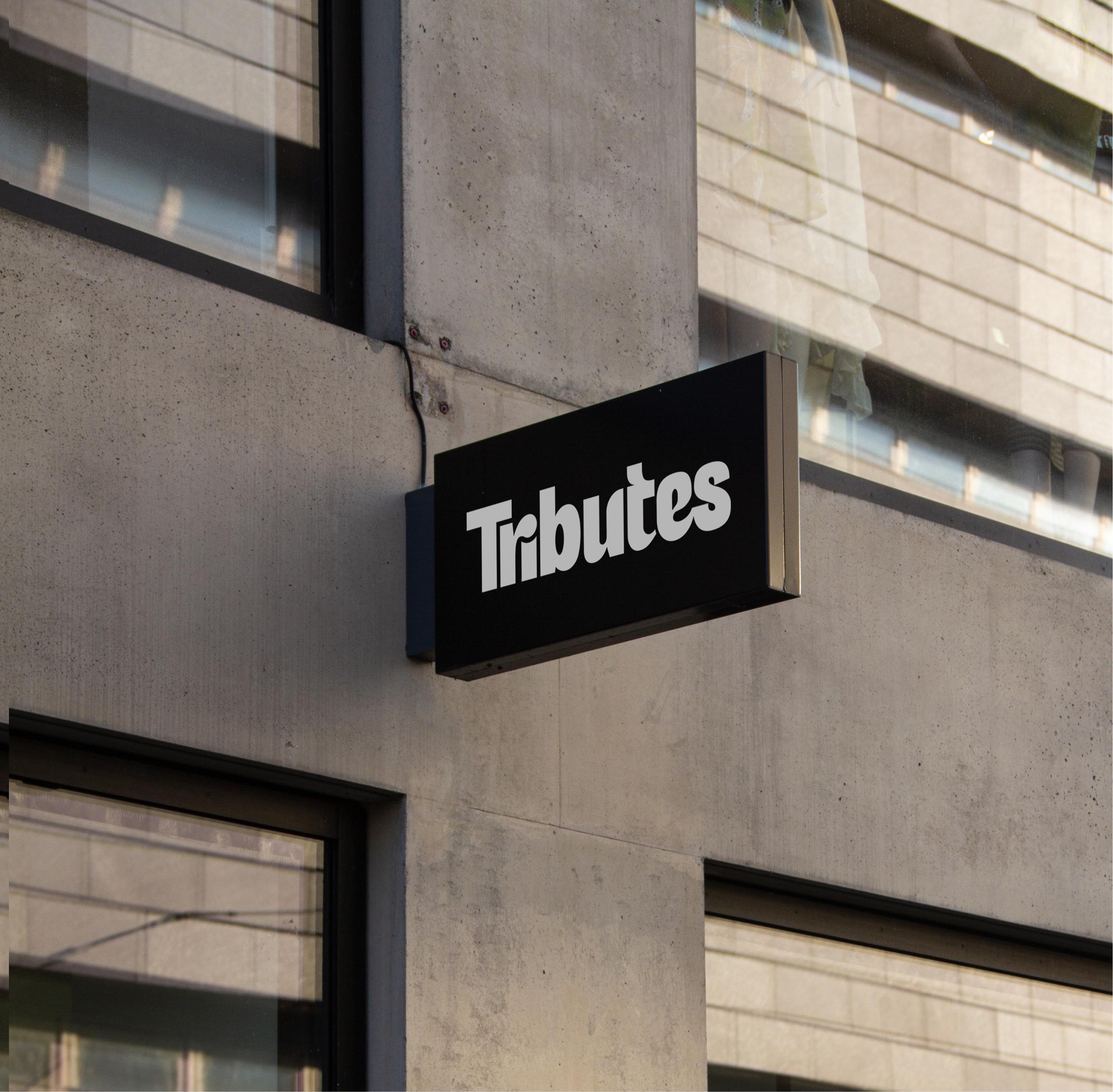
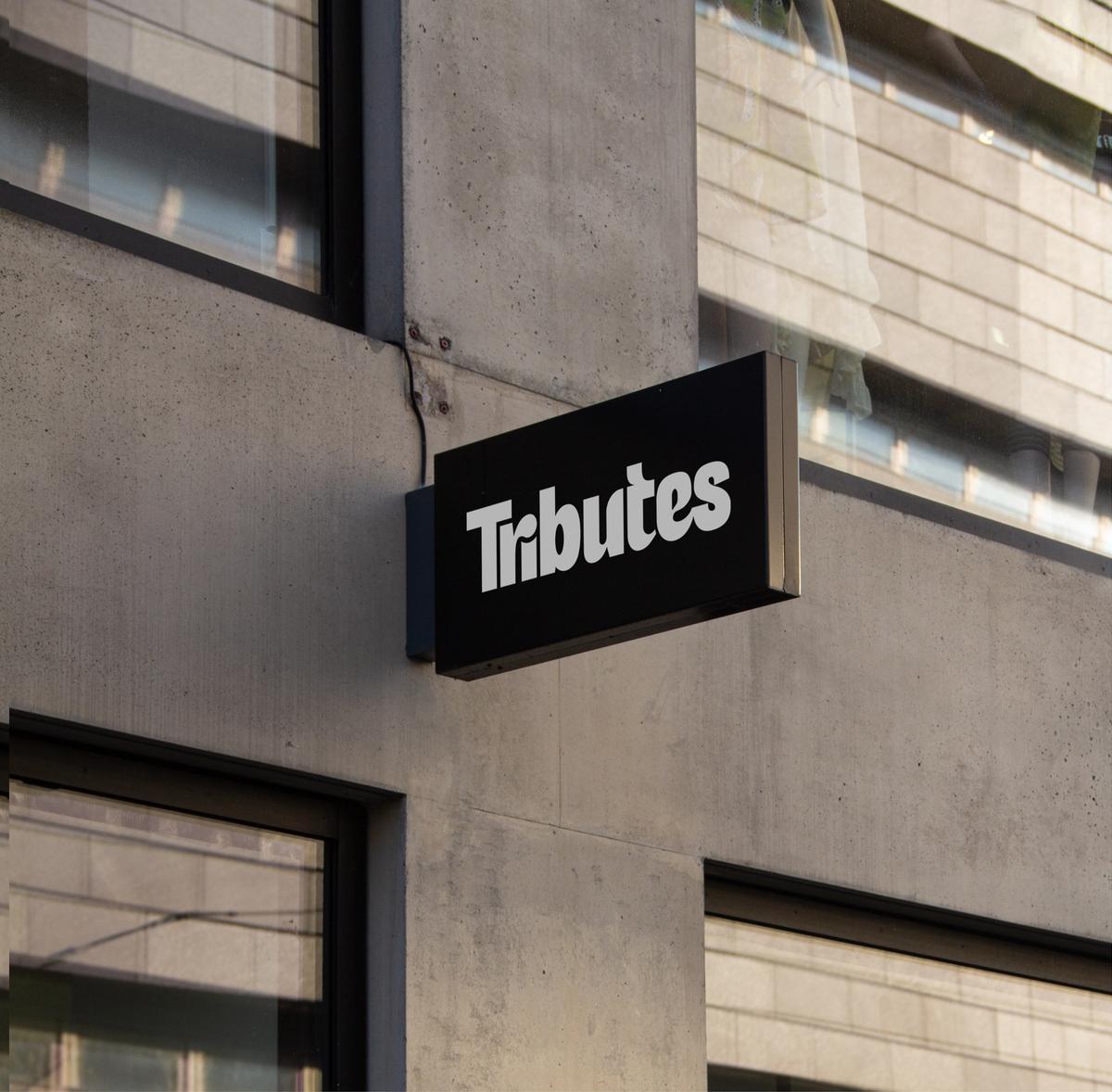
Tributes · Brand identity
Building a brand as bold as the work behind it
Tributes came to Built by Field with a concern that the vibrant, technically capable work happening on their shop floor wasn't reflected in how their brand presented itself. We set out to build an identity that could hold its own alongside the products they produce.

We developed a bold new logo with movement and personality. The final direction was welcoming, and slightly unconventional, designed to look great when printed on bags, shirts, and merchandise. The wordmark is approachable, reflecting the tactile nature of their work and the collaborative culture behind it.
The identity is anchored in a striking, vibrant blue, chosen not just for visual impact, but as a conceptual device. In printing, blue ink is bold, saturated, and permanent. It stains, and leaves a lasting impression. Paired with warm, grounded neutrals, the palette balances energy with craftsmanship.


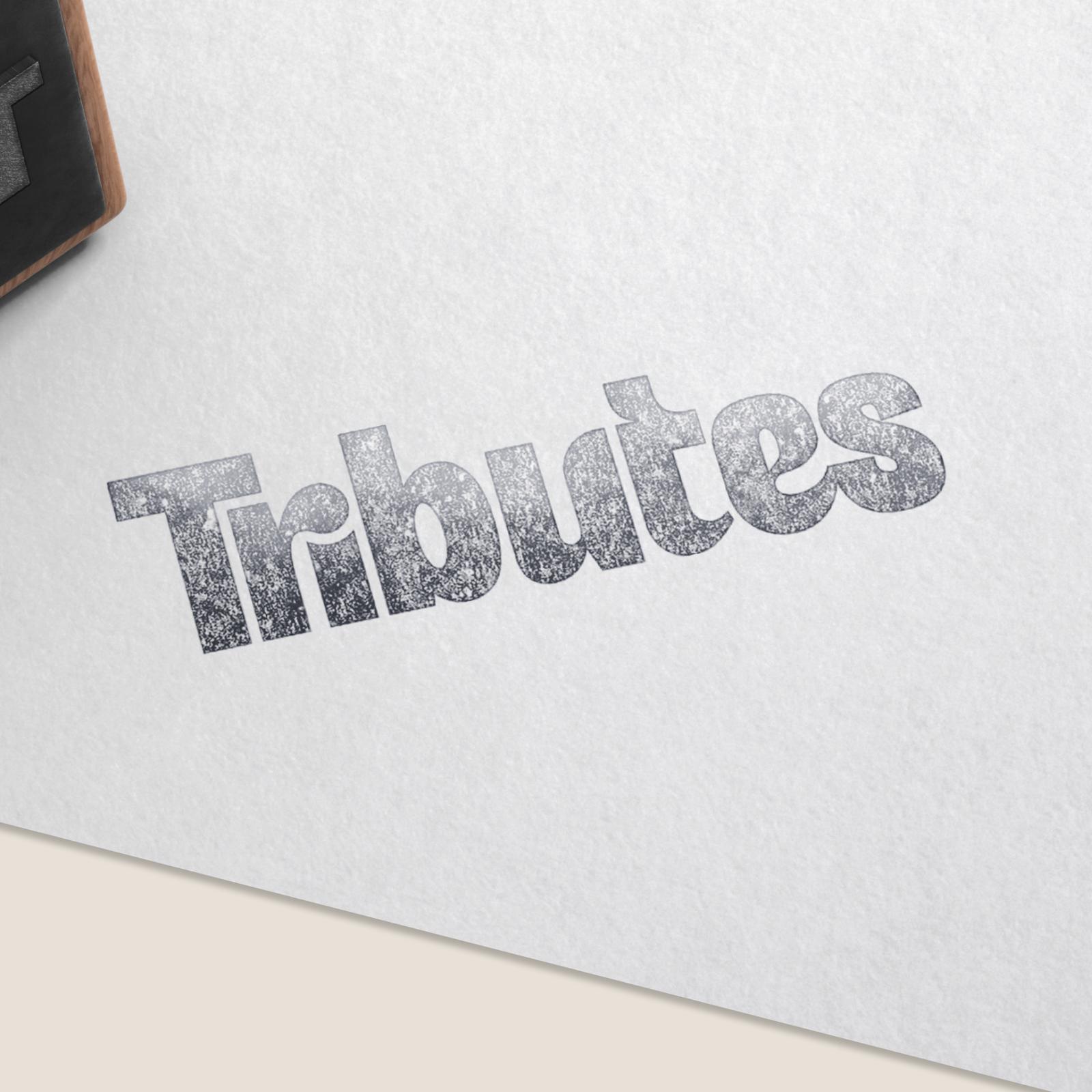

To further emphasize Tributes' production expertise, we created a suite of screen-print–inspired background graphics using the signature blue ink tone. These ink-textured elements nod to traditional print techniques while showcasing the wide range of surfaces Tributes works with. The brand system also incorporates a ripped-paper aesthetic, reinforcing the concepts of process, layering, and hands-on production.
Strong product photography was critical to supporting the new identity. We encouraged Tributes to invest in new imagery and connected them with photographer Peter Kaczan to develop a cohesive product suite. While we provided art direction around simplified backgrounds and warm tonal consistency, Peter brought his own eye and craft to the work. The final imagery elevates the brand with clean compositions that let the products, finishes, and detail take centre stage.
The refreshed Tributes brand is vibrant, confident, and rooted in print. It captures Tributes’ in-house capability, highlights their breadth of production, and positions them as expert collaborative partners. The brand identity wrapped up in late 2024, laying the foundation for the website work to follow.
Details
- Client
- Tributes
- Year
- 2024
- Work
- Brand design, Visual identity
- With
- Peter Kaczan, Photography
More for Tributes
Website2026
Translating the shop floor experience into digital form

