
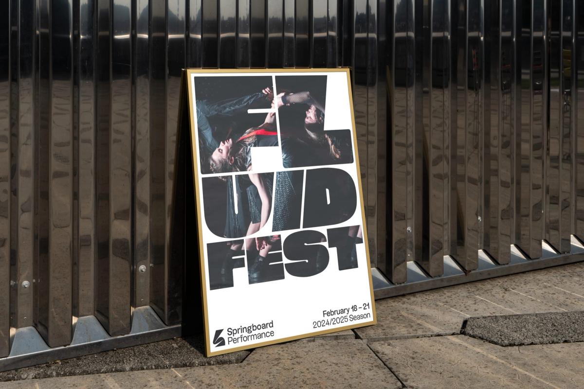
Springboard Performance · Brand
Building a brand based on movement

Built by Field partnered with Springboard in fall 2022 to develop a brand to keep pace with their day-to-day and hold together across a wide variety of aesthetics without flattening them.
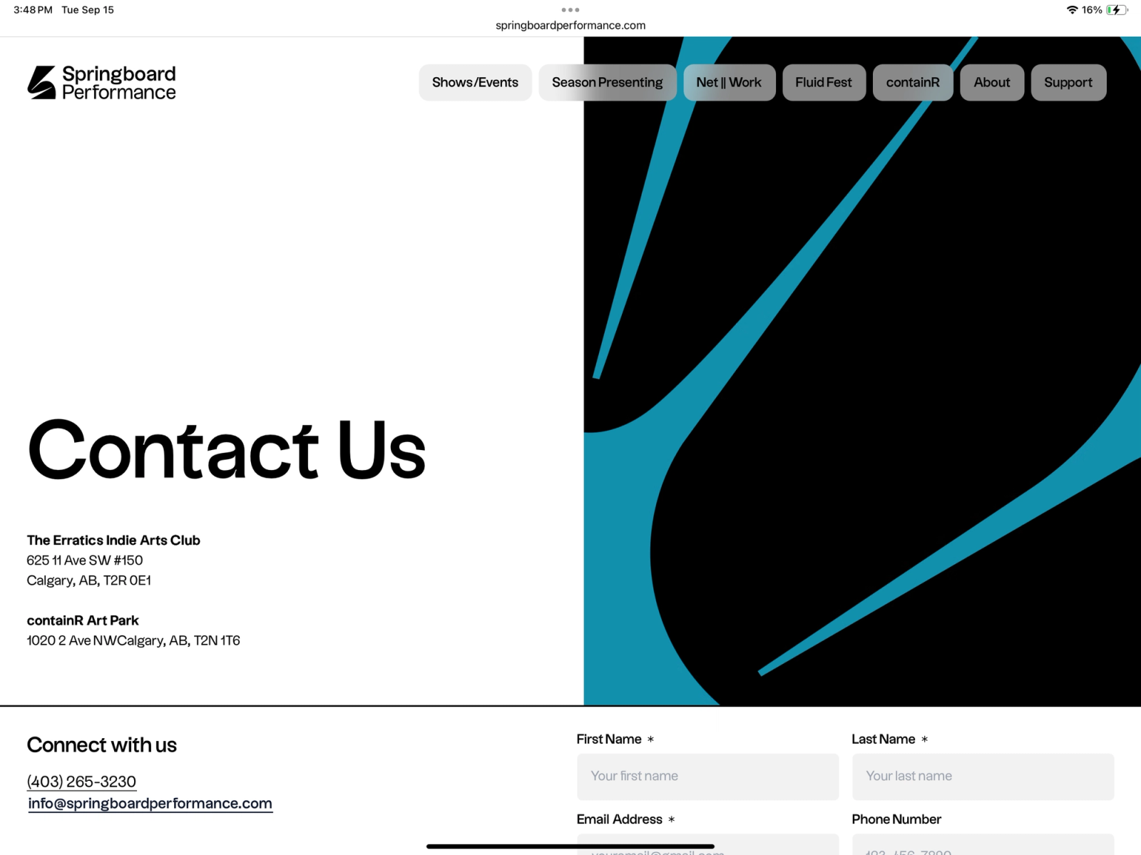
First, we needed to redesign their logo mark. Springboard's work is rooted in physical expression and movement, so it’s easy for a static letterform to lose that energy. We created an elegant, kinetic "S" mark which folds over itself with fluid curves and proportions, spotlit at each end.
The letter mark system extends to the letters B and P as well, used as graphic textures for backgrounds and print applications. The typeface’s with distinctive letter hooks read quietly on first glance, but are very distinctive on closer inspection. The mark itself is black and white by default, shifting color to match the photography it's paired with.

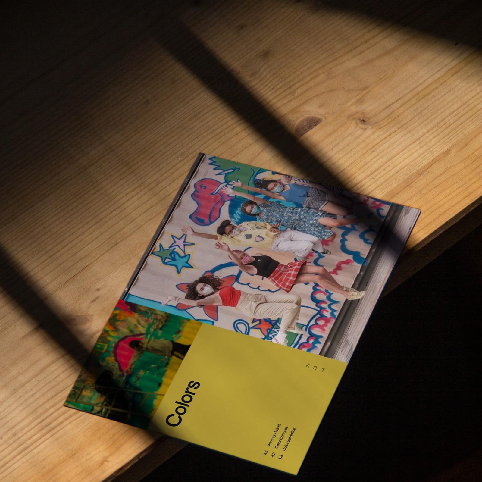
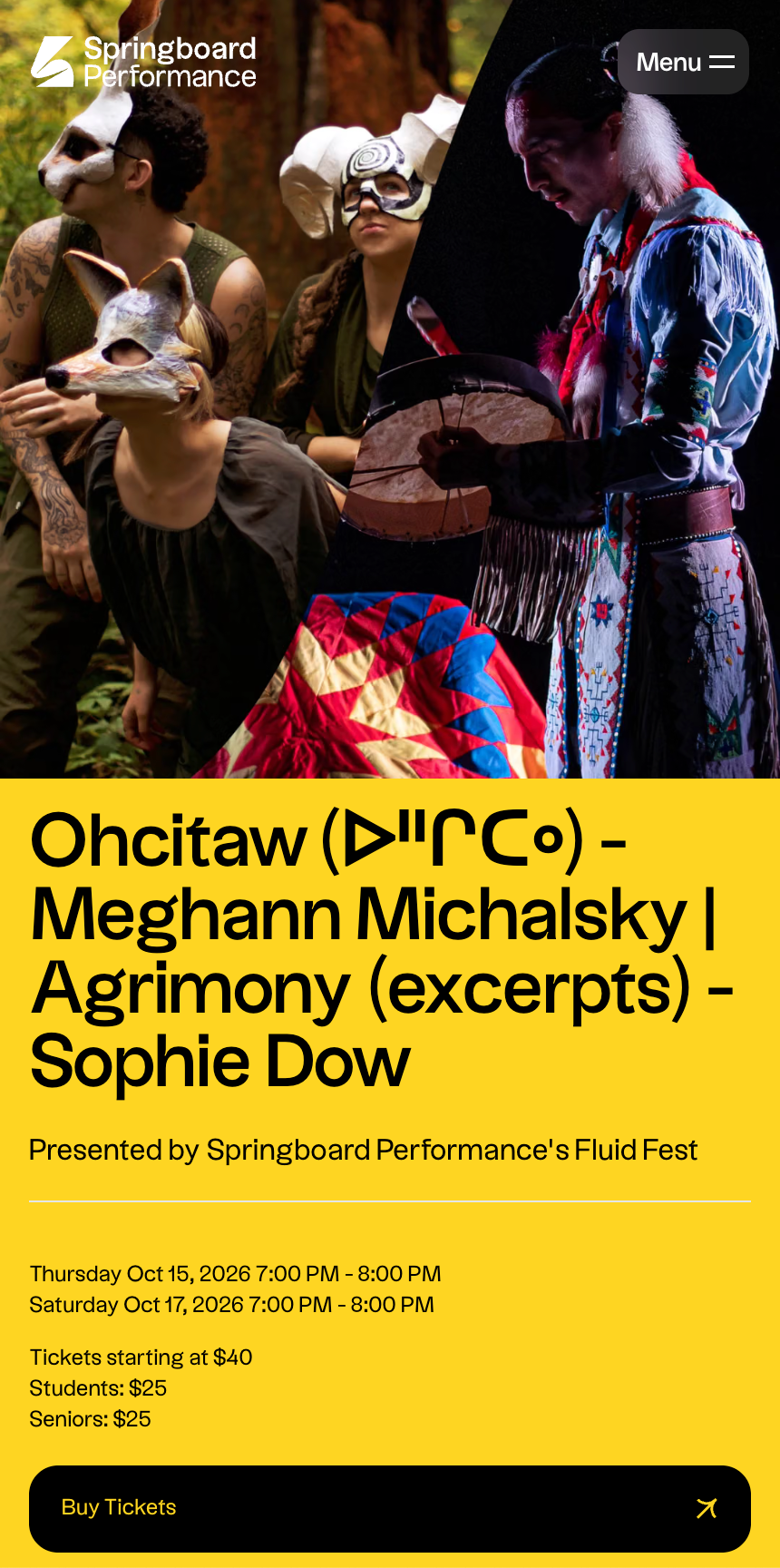
The brand’s relationship to color is where the design system becomes genuinely responsive. Rather than assigning Springboard a fixed palette, we built their color logic around black and white as anchors, with supporting colors to be drawn from event photography. Each of Springboard’s productions brings its own visuals to the table, we instead enabled the brand to adjust alongside imagery as needed. This results in a visual identity that can transform show-to-show while remaining unmistakably itself.
To test the system beyond the screen, we mocked up applications for event posters, banners, tote bags, and physical signage, ensuring that the brand would look great across a variety of environments.
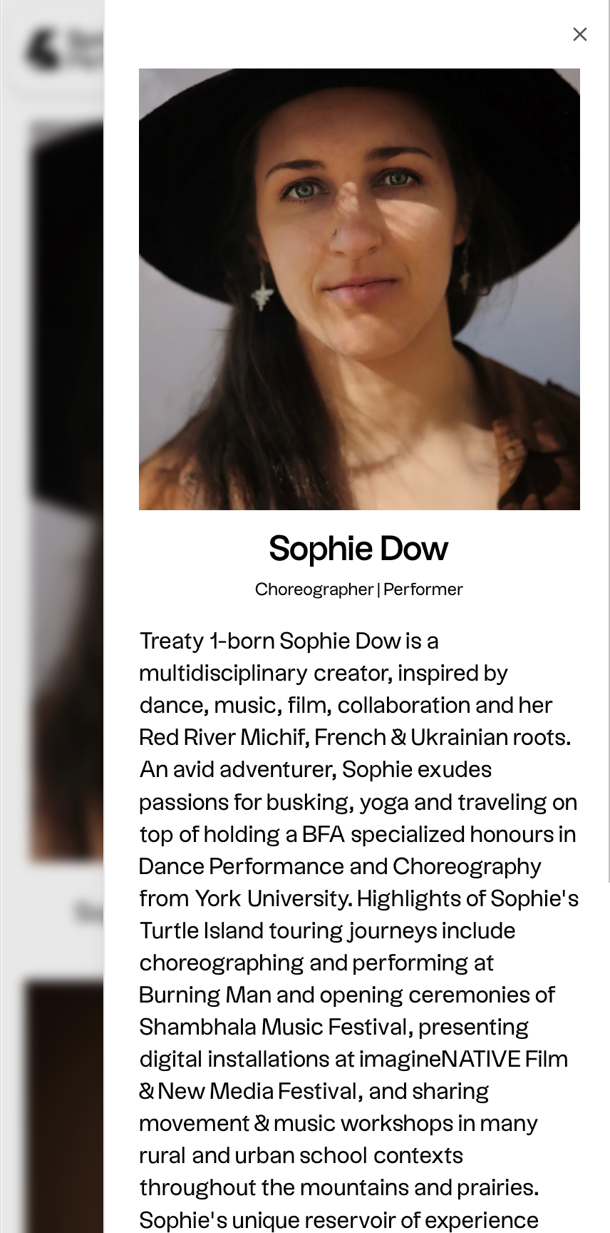
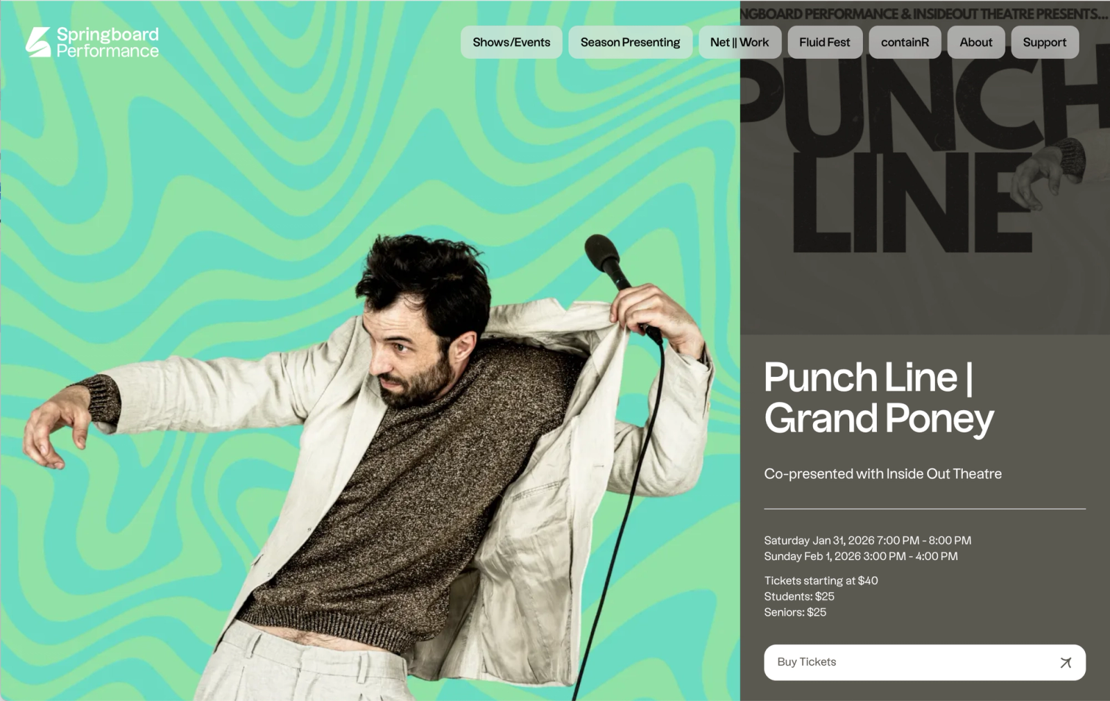
The brand document was delivered in December 2023, covering the logo system, typography (Messina Modern, Messina Sans, and Uxum Grotesque), color philosophy, and photography direction. It has been in active use since, flexing across Springboard's programming without requiring adjustment.
Details
- Client
- Springboard Performance
- Year
- 2023
- Work
- Brand design, Visual identity
More for Springboard Performance
Website2024
An event-driven experience

