Design systems
Brand · Structure
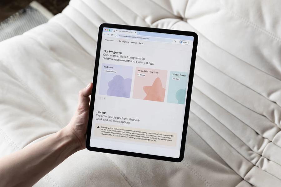
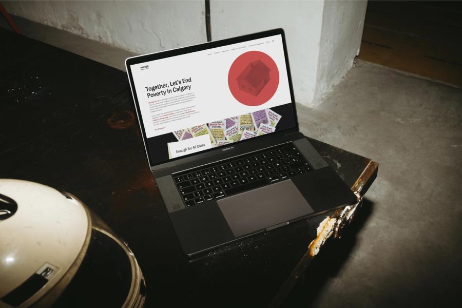
We turn a brand into a design system that a team can build with, defining colour scales, type, spacing and components closely enough to code from. The same system runs the website and the CMS blocks editors publish with, and it can carry into document templates and print.
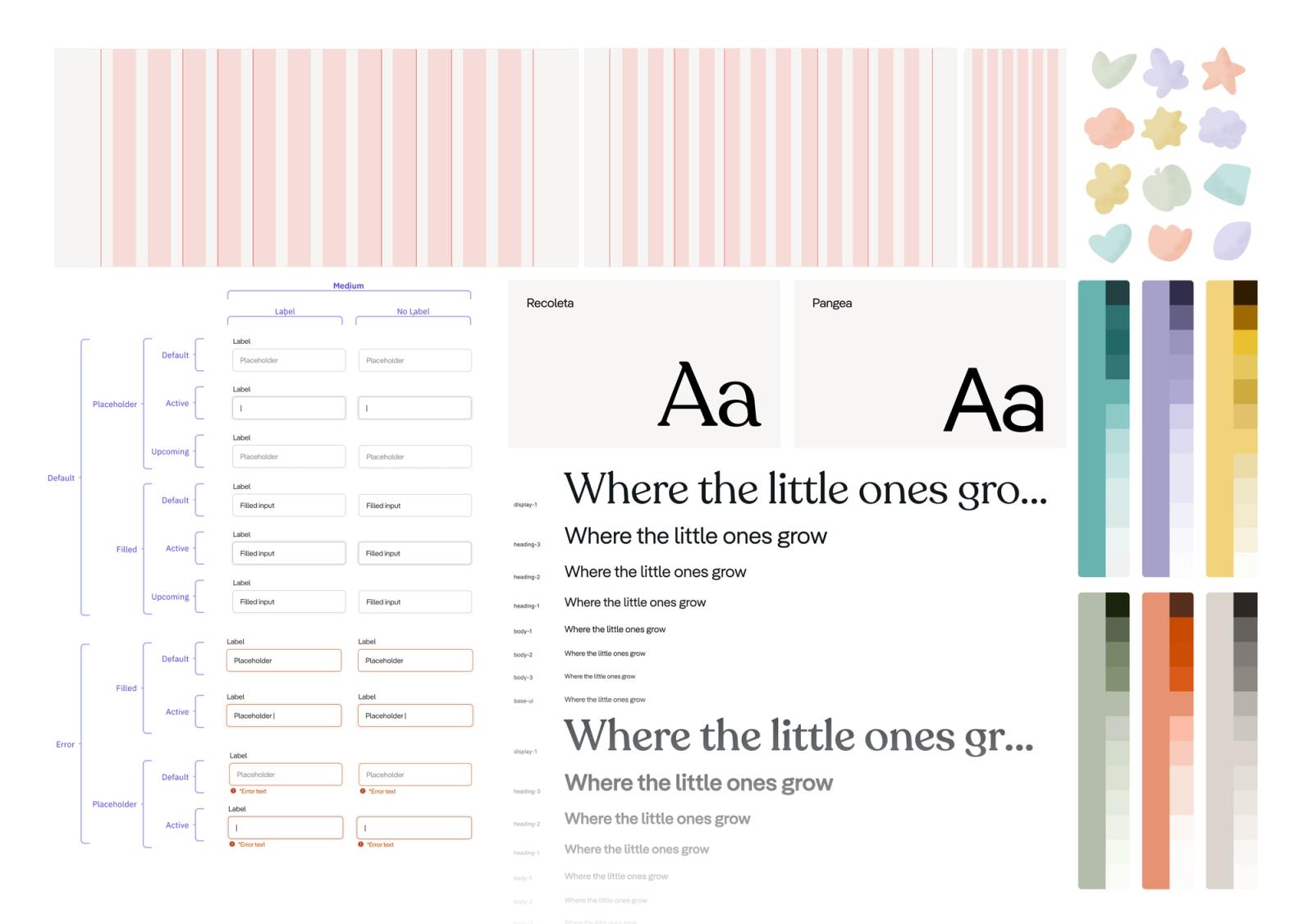
A brand you can build with
Most brand guidelines describe how a brand should look. They start to fail when someone builds a product from them, because the colours may not pass contrast checks, the type scale has never met a long paragraph, and missing components get improvised under deadline.
We design systems that close that gap, with tokens, type scales, colour roles, spacing and components specified closely enough to build from directly. We also build the product with the system, so it gets tested on real pages before we call it finished.
Building on Wee Wild Ones' palette
Wee Wild Ones came with brand colours worth keeping and a network of centres about to grow. We kept the palette and developed it into full colour scales, with rules for where each hue appears. Recoleta's curved letterforms set the headlines and Pangea, a geometric sans-serif, steadies everything around them, while simple illustrated shapes and textures carry the warmth. New centres launch from the same parts.
Playful without being kitschy
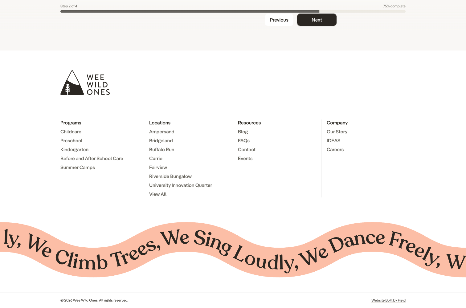
A rolling squiggle marquee runs along the footer of the Wee Wild Ones site. It is a small touch, and it sets the tone the rest of the system aims for.
Classroom Champions' block library
Classroom Champions' Webflow site had collected so many plugins that routine edits risked breaking it. We rebuilt it on Prismic and Next.js, settled the brand on one typeface, Work Sans, and developed tonal colour scales from the palette they already had. The marketing team now builds pages from a modular block library, and the system handles the fonts, colours and layout for them.
Pages the team assembles
Classroom Champions' marketing team builds pages from a block library, and the pages stay on brand because the blocks carry the design system.

In the code and the CMS
Our design systems continue past Figma into the product. Design tokens live in the codebase, components match their specs, and CMS blocks make the on-brand choice the easy one for editors. When the University of Calgary's Global Learning Toolkit grew to include document templates and printable infographics, the design system from the website carried into those as well.
Selected work
2025–2026
2025–2026
Wee Wild Ones Design System and Website
Design systems, Web design, Web development, Content management systems, Content modelling, Custom CMS tooling, Multilingual and multi-region systems

Design systems, Web design, Web development, Content management systems, Content modelling, Custom CMS tooling, Multilingual and multi-region systems
2021–2022
2021–2022
Classroom Champions Marketing Website Revamp
Web design, Web development, Content management systems, Content modelling, Design systems
Web design, Web development, Content management systems, Content modelling, Design systems
2020–2021
2020–2021
Enough For All Website Unification and Rebrand
Web design, Information architecture, Web development, Brand design, Content management systems, Content modelling, Content strategy, Design systems

Web design, Information architecture, Web development, Brand design, Content management systems, Content modelling, Content strategy, Design systems
Tools we reach for
- Figma
Have a brand that needs a system?
We can start from a new brand or from the guidelines you already have.
All capabilities
Brand
Structure
- Design systems
- Digital strategy