

Ava Industries · Brand Identity
Improving medical care, one site at a time.
When Ava's EMR product began to scale, their brand needed to keep pace, so in late 2021, Ava partnered with Built by Field to close that gap. The strategic frame was already present in Ava's own tagline: "created by doctors, for doctors". Our work was to make that claim legible at a glance.
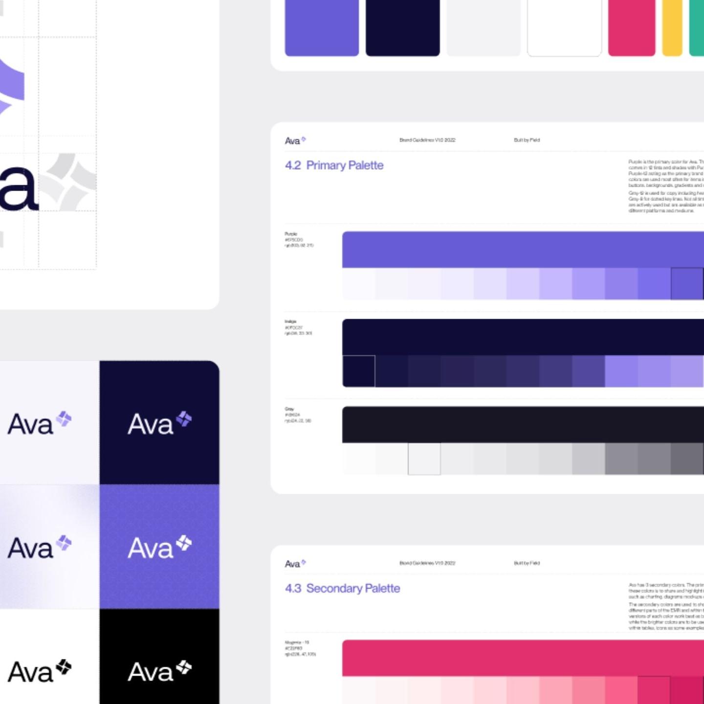
We wrote the brand name in title case rather than all-caps, which positions Ava as approachable rather than institutional, professional without the distance that characterizes most clinical software. The logomark develops this idea further with a spiral of abstracted forms using a scale of the brand's primary purple, reading as papers or records in motion. Patient files are dynamic, constantly updated and in use, and the mark reflects that quality without being too literal about it.
Both horizontal and vertical logo orientations were developed from the outset, giving the team flexibility across print, digital, and environmental applications.

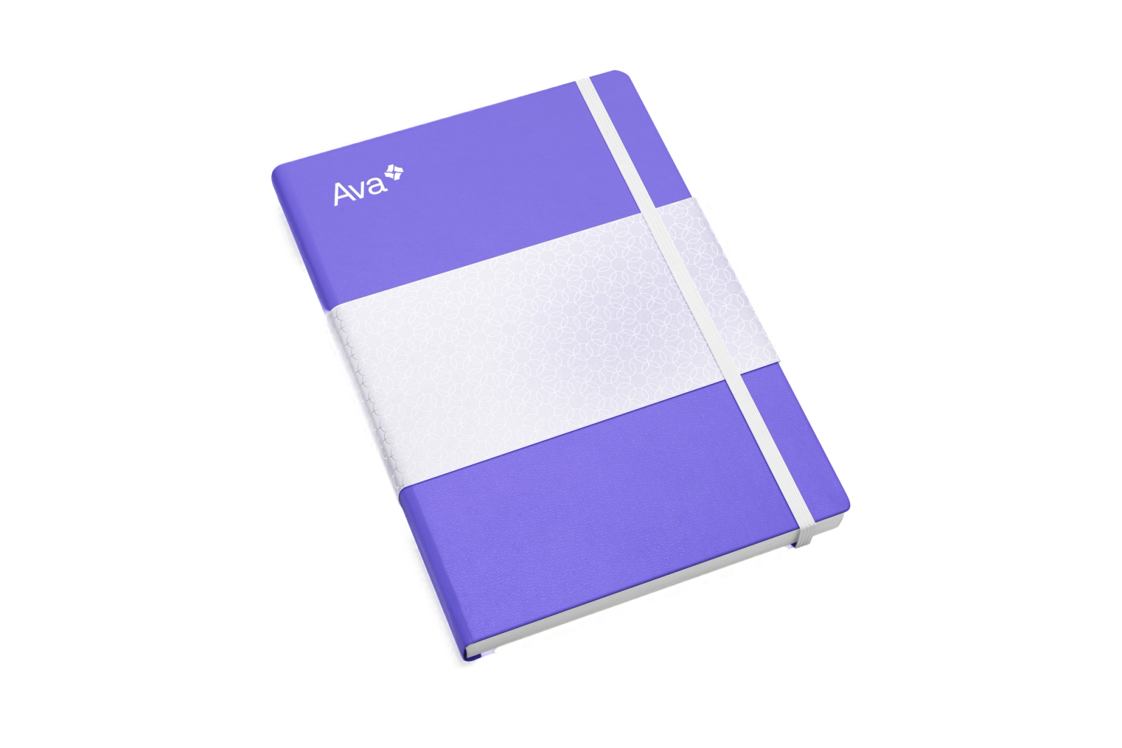
By building a full tonal scale for each brand color, we gave Ava's team a system that holds together whether it’s in a marketing deck or a clinical interface. The finished colour scales are consistent without being overly rigid.
The resulting work gave Ava EMR a visual identity that could carry the weight of a platform that’s rigorously built by people who understand their industry’s problems from the inside.
Details
- Client
- Ava Industries
- Year
- 2022
- Work
- Brand design, Visual identity
More for Ava Industries
Website Redesign2023
Creating an online presence for Ava
