


Whispir ↗︎
2021–2022
The right channel at the right time


2022–2023
Electronic Medical Record software built by doctors, for doctors. What started as an internal fix for a single Calgary clinic has grown into a platform serving over 2,500 providers across more than 300 clinics in Alberta, British Columbia, and Ontario.
When Ava's EMR product began to scale, their brand needed to keep pace, so in late 2021, Ava partnered with Built by Field to close that gap. The strategic frame was already present in Ava's own tagline: "created by doctors, for doctors". Our work was to make that claim legible at a glance.

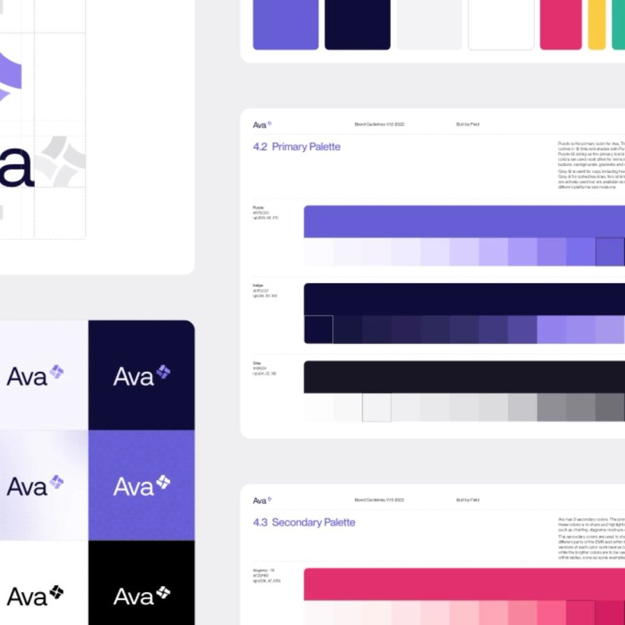
We wrote the brand name in title case rather than all-caps, which positions Ava as approachable rather than institutional, professional without the distance that characterizes most clinical software. The logomark develops this idea further with a spiral of abstracted forms using a scale of the brand's primary purple, reading as papers or records in motion. Patient files are dynamic, constantly updated and in use, and the mark reflects that quality without being too literal about it.
Both horizontal and vertical logo orientations were developed from the outset, giving the team flexibility across print, digital, and environmental applications.


By building a full tonal scale for each brand color, we gave Ava's team a system that holds together whether it’s in a marketing deck or a clinical interface. The finished colour scales are consistent without being overly rigid.
The resulting work gave Ava EMR a visual identity that could carry the weight of a platform that’s rigorously built by people who understand their industry’s problems from the inside.
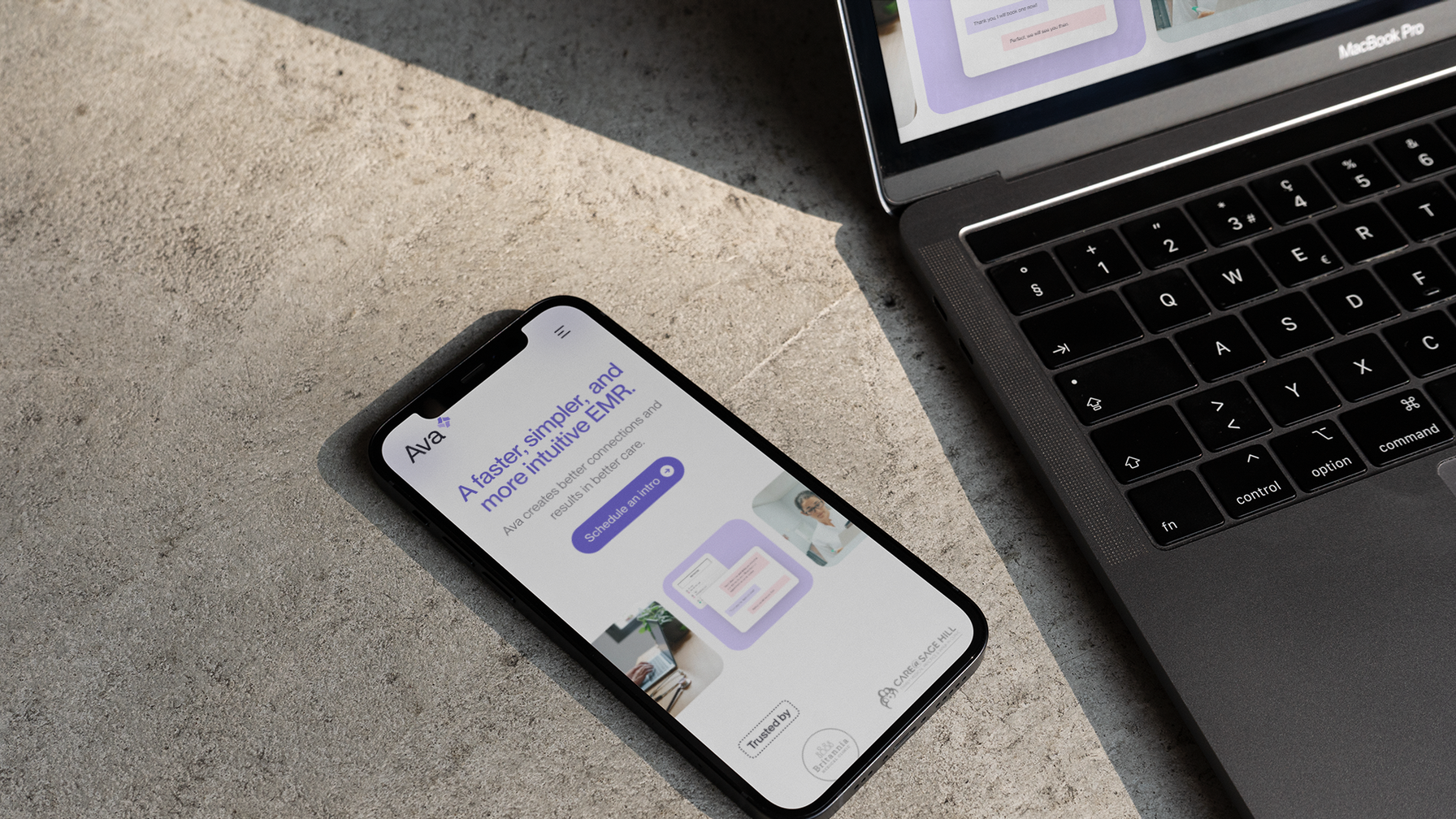
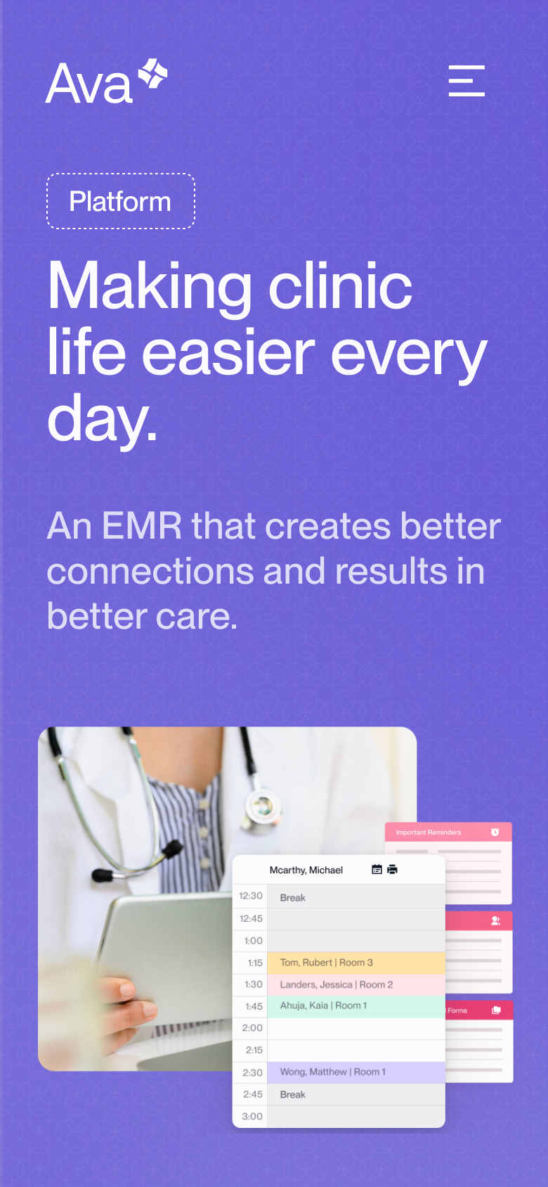
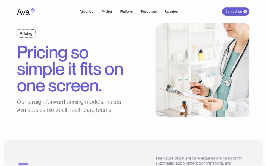
Ava needed a website that could do two things at once: convince prospective clients that a physician-built EMR was worth their attention, and give existing users somewhere reliable to find help. That's a wider brief than it looks, as marketing and support typically pull a site's structure in opposite directions.


We recommended Next.js with Sanity as a headless CMS, a combination that would give us the flexibility to build a custom front-end while leaving Ava's team with a content layer they could manage themselves without developer involvement for each update. Maintainability wasn't an afterthought; it was a condition of the architecture from the start.
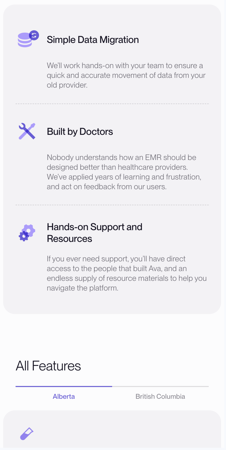
The design problem was primarily one of legibility. EMR interfaces are dense by necessity, and showing them risks making the product look intimidating before a prospective user has any context. Instead, we abstracted the service's graphical elements into visuals that show the structure of the interface without requiring the viewer to parse every little detail. The goal was to communicate high-level features of the platform while remaining approachable and scannable without oversimplifying. A subtle background texture in the hero grounds the brand while letting the product take the foreground.
Typography follows the same logic. Clean sans-serif headings pair with high-legibility body text, and generous white space reflects what Ava's platform actually promises: workflows that don't create friction.


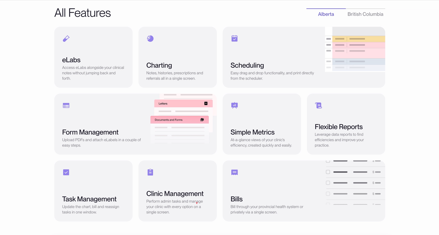
The support side of the site required its own solution. Documentation is notoriously hard to keep current, and a flat page of links can quickly fall behind. We built a custom Resource content model in Sanity so that individual tutorial pages function as discrete documents, feeding automatically into a single organized library without manual sorting. The folks at Ava can add or update a resource without touching the site's structure.
The result is a platform that grows with the business rather than requiring a rebuild every few years.
The right channel at the right time

Supporting and strengthening the arts to benefit all Calgarians


