Ava Industries · Website Redesign
Creating an online presence for Ava
Ava needed a website that could do two things at once: convince prospective clients that a physician-built EMR was worth their attention, and give existing users somewhere reliable to find help. That's a wider brief than it looks, as marketing and support typically pull a site's structure in opposite directions.
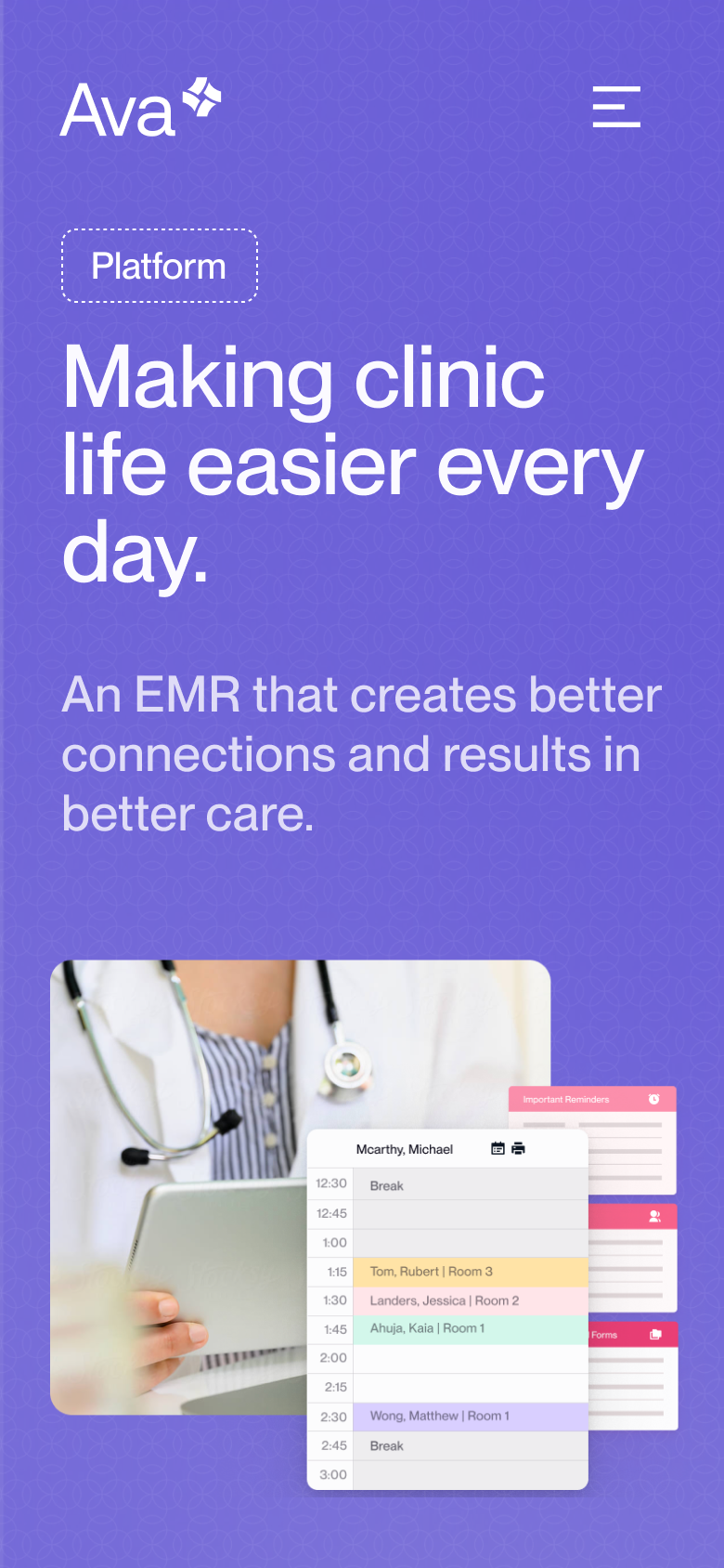

We recommended Next.js with Sanity as a headless CMS, a combination that would give us the flexibility to build a custom front-end while leaving Ava's team with a content layer they could manage themselves without developer involvement for each update. Maintainability wasn't an afterthought; it was a condition of the architecture from the start.
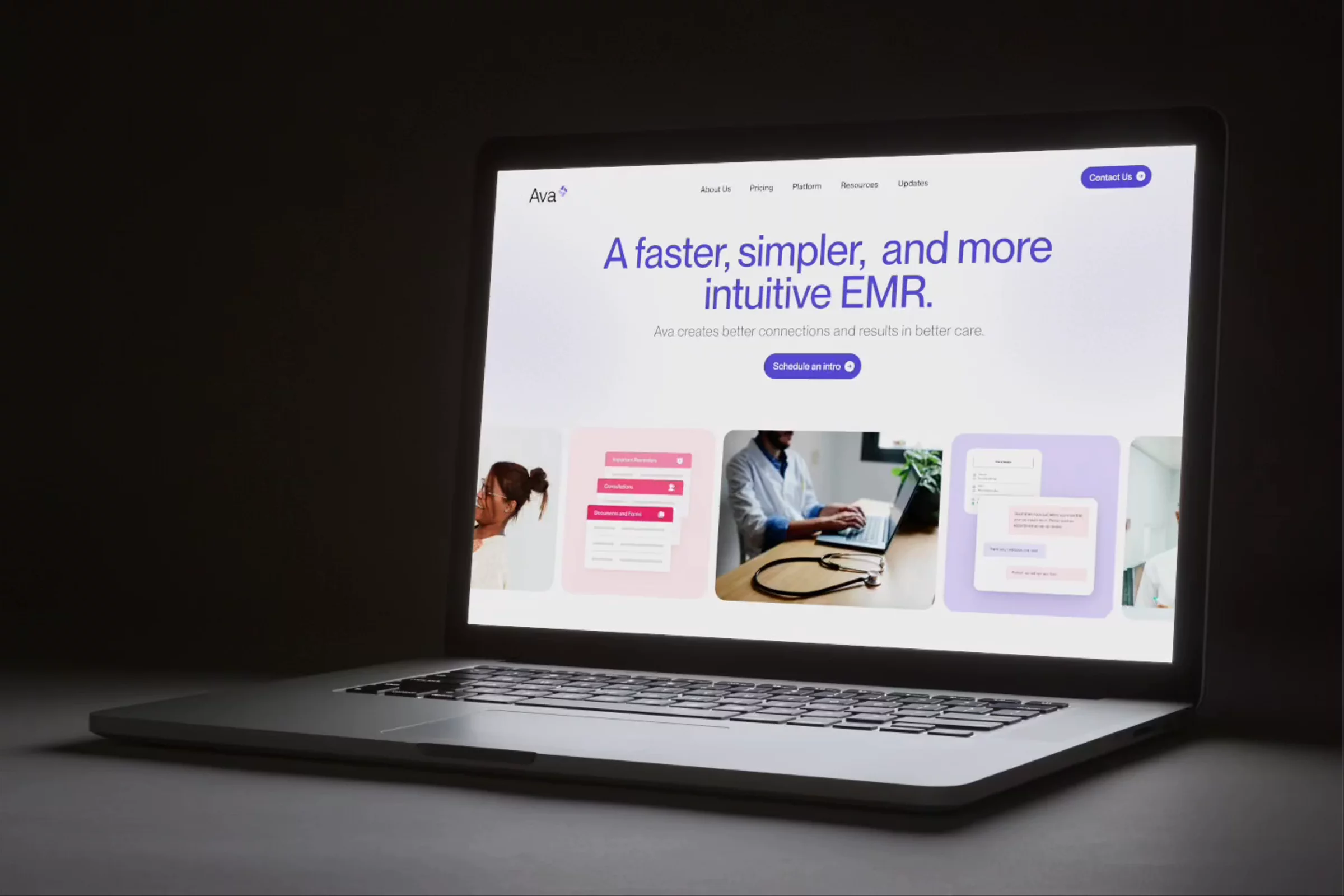
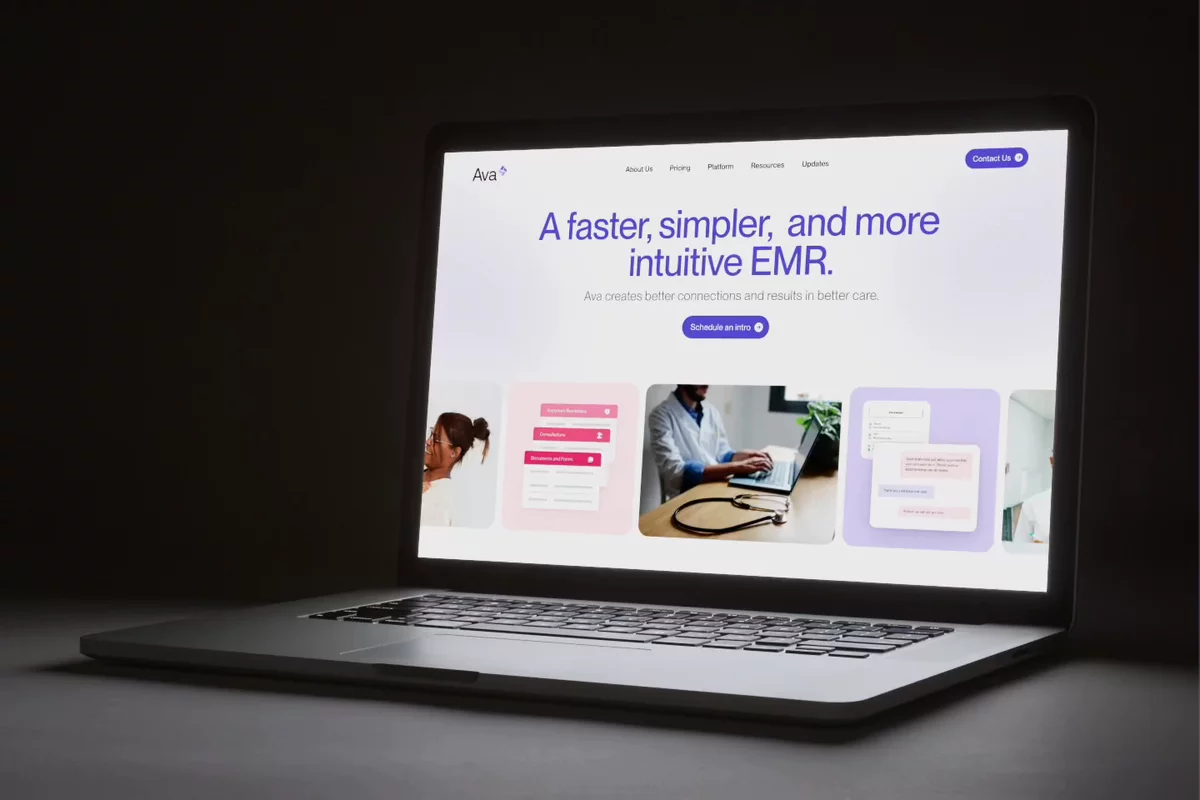
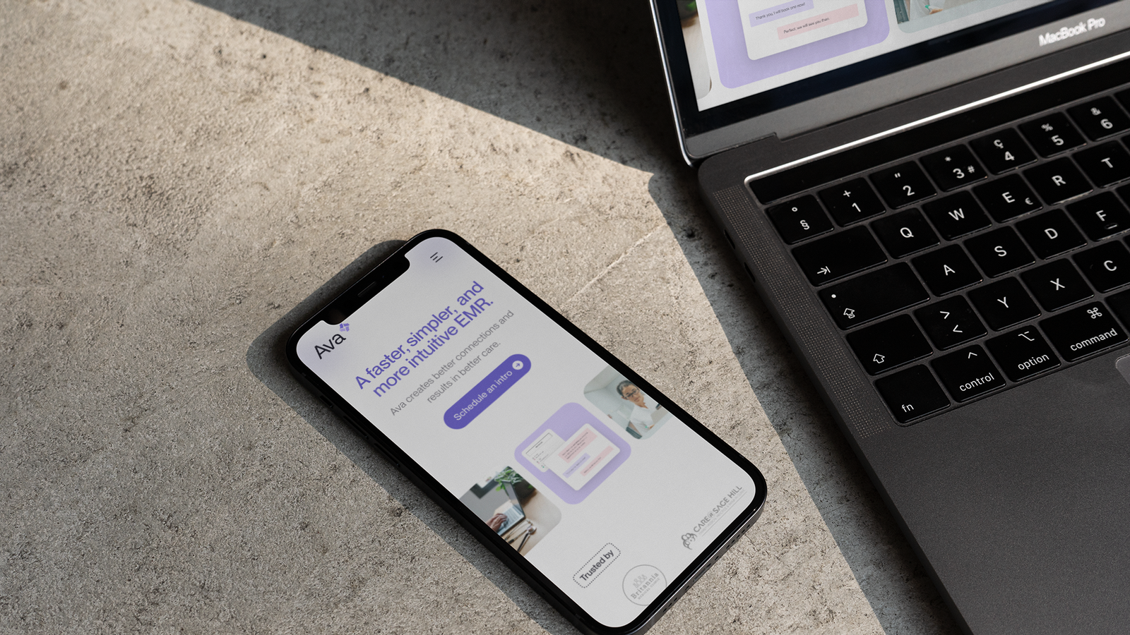
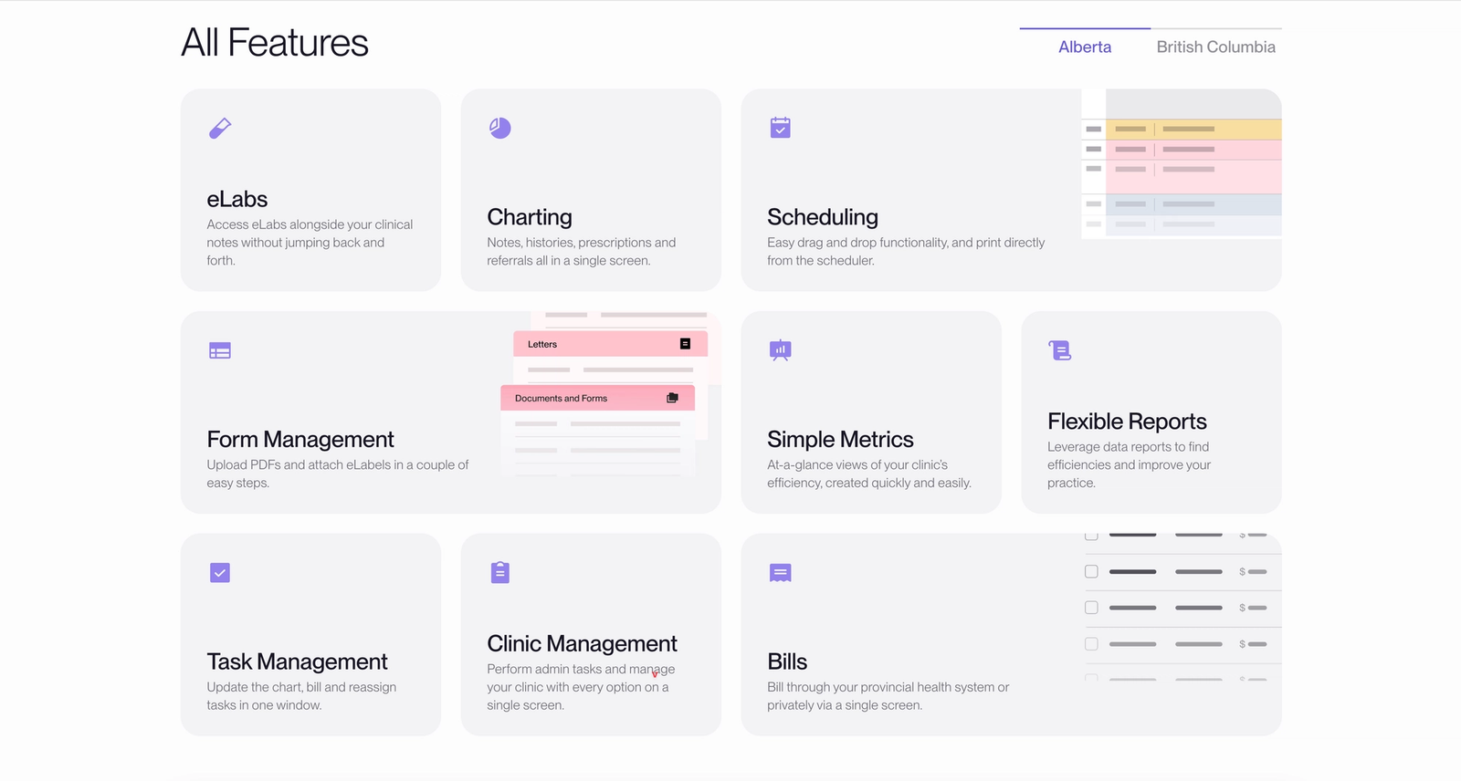
The design problem was primarily one of legibility. EMR interfaces are dense by necessity, and showing them risks making the product look intimidating before a prospective user has any context. Instead, we abstracted the service's graphical elements into visuals that show the structure of the interface without requiring the viewer to parse every little detail. The goal was to communicate high-level features of the platform while remaining approachable and scannable without oversimplifying. A subtle background texture in the hero grounds the brand while letting the product take the foreground.
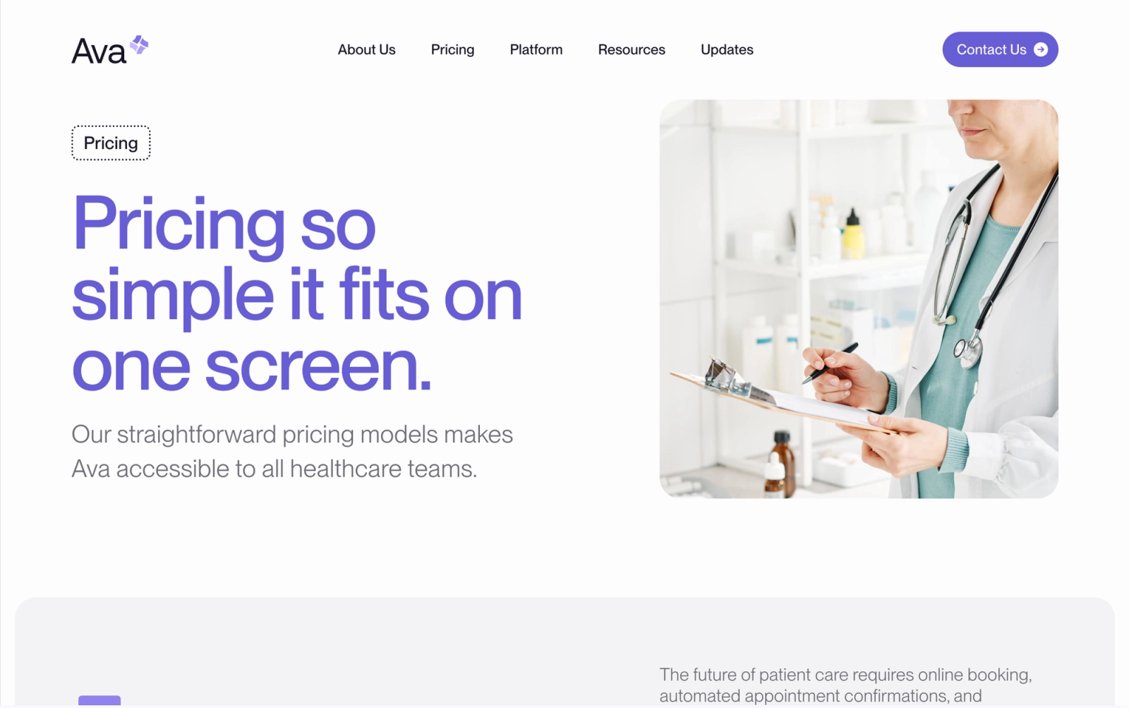
Typography follows the same logic. Clean sans-serif headings pair with high-legibility body text, and generous white space reflects what Ava's platform actually promises: workflows that don't create friction.
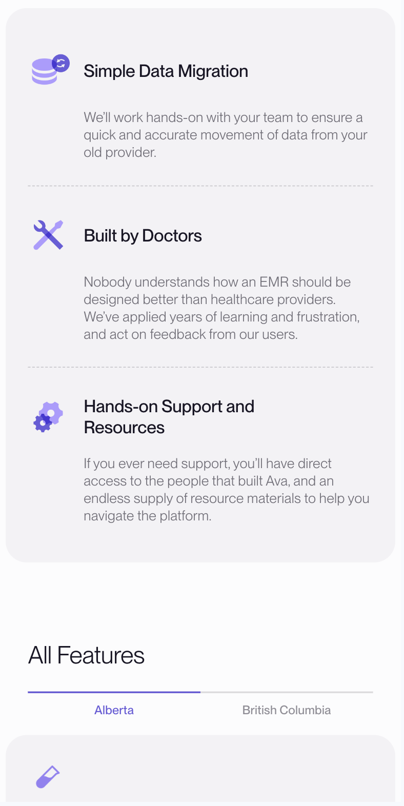
The support side of the site required its own solution. Documentation is notoriously hard to keep current, and a flat page of links can quickly fall behind. We built a custom Resource content model in Sanity so that individual tutorial pages function as discrete documents, feeding automatically into a single organized library without manual sorting. The folks at Ava can add or update a resource without touching the site's structure.
The result is a platform that grows with the business rather than requiring a rebuild every few years.
Details
- Client
- Ava Industries
- Year
- 2023
- Work
- Web design, Web development, Content management systems, Information architecture, Content modelling
More for Ava Industries
Brand Identity2022
Improving medical care, one site at a time.