Marketing website
The existing site carried the organization's voice well, but it was built for a smaller version of the organization. Pages were laid out individually, so every new program meant new design work, and the paths through the site didn't distinguish between different groups of people and their needs.
The lack of audience-specific messaging was a structural problem that needed to be addressed before we got into design. While a program-led navigation is great for search and the brand, it may not be the best fit for a teacher who isn't familiar with the organization's programs.
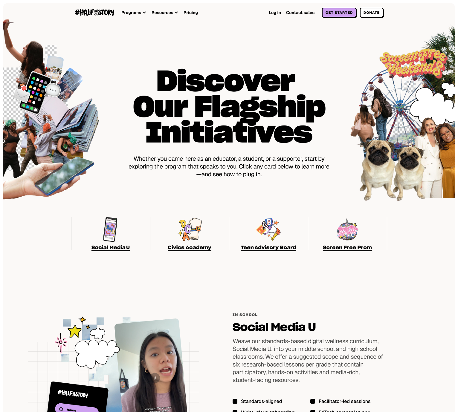
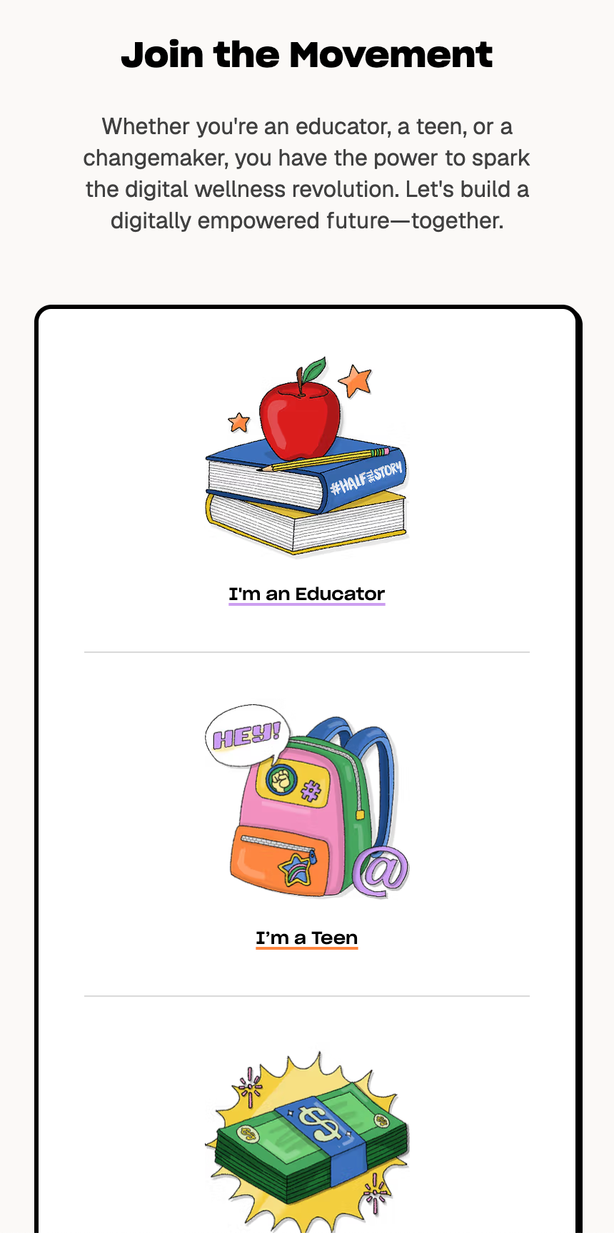
We solved the need for both types of nav by implementing a mix of both. The primary navigation stays program-first, but the programs are bucketed into audience-specific dropdowns for educators, teens and funders. We also included context-aware calls to action on the program pages, so an educator reading about a program is offered classroom resources rather than a general contact form. This allows people discovering #HalfTheStory for the first time to find their way to what they need much more easily than before.
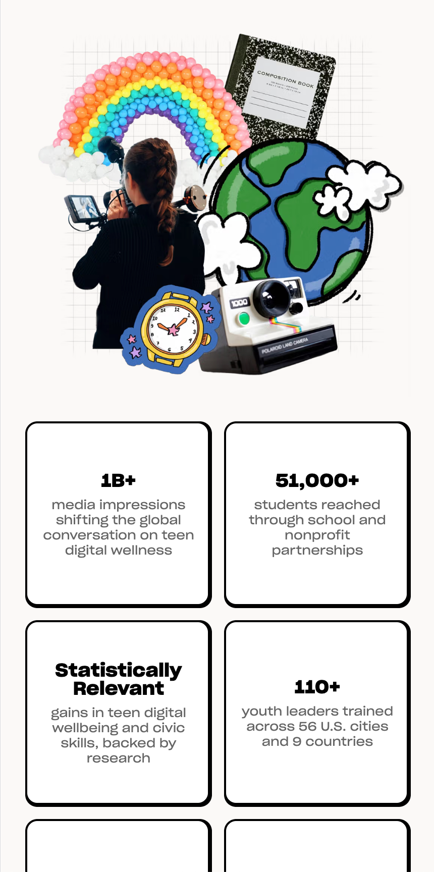
The site’s collages are eye-catching and memorable. Each one is a stack of layered elements, cut-out clouds with hand-drawn outlines, a skateboarder, a paper plane, arranged over open sky with actual real depth between the layers. These collages bring a lot of energy to the site, and are a far cry from the stock imagery that nonprofit sites usually settle for.


Getting the collages into the CMS and giving them real life and layering required a bit of thinking. Each collage is a set of layers with individual positions and proportions, and one of the trickier elements was how these would translate between a desktop screen and a vertical phone layout. We built a structure in Sanity that allows each layer to be swapped out individually and allows for both aspect ratios to be accounted for, so the team can build new compositions without a designer rebuilding the page.
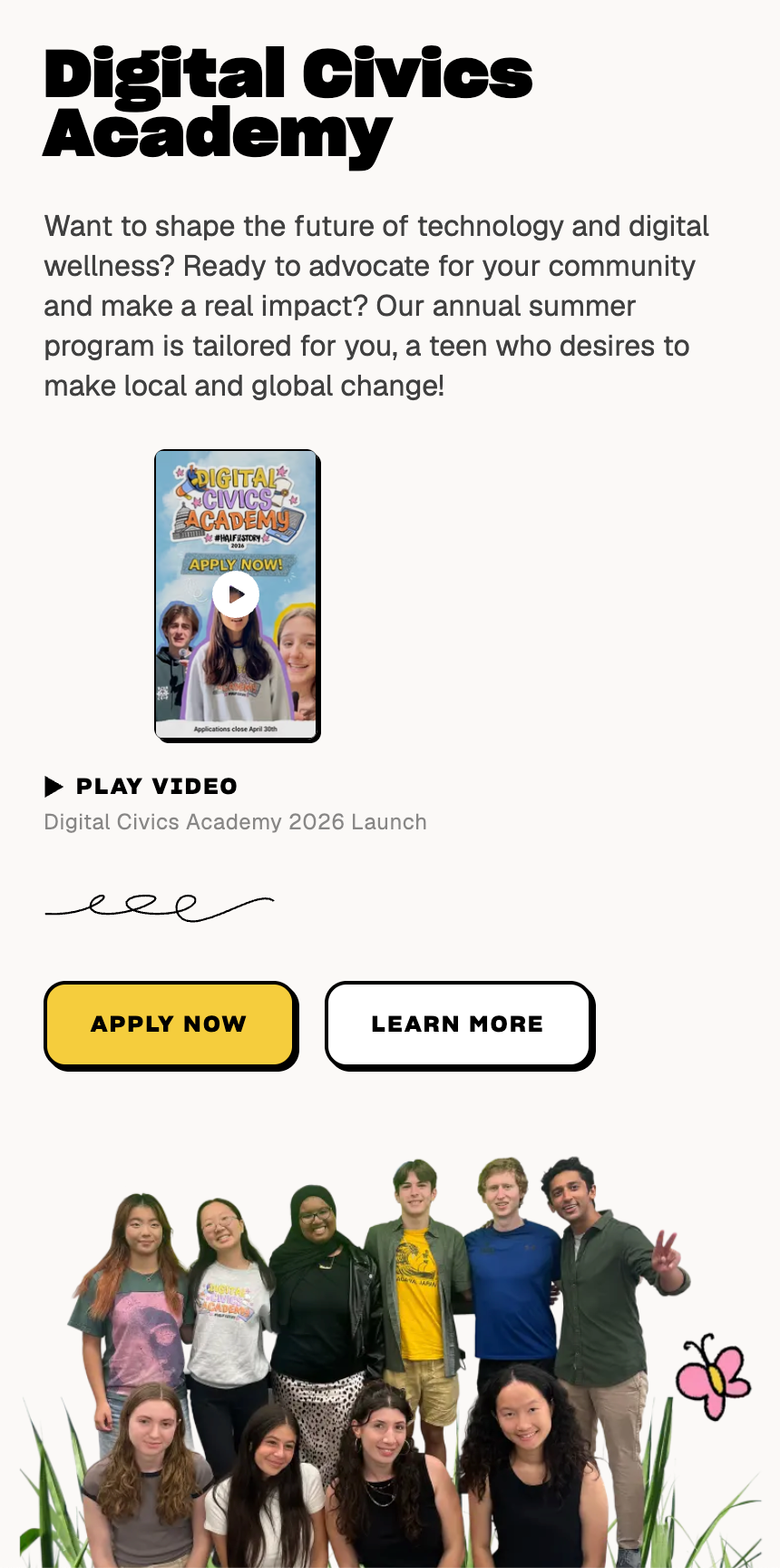
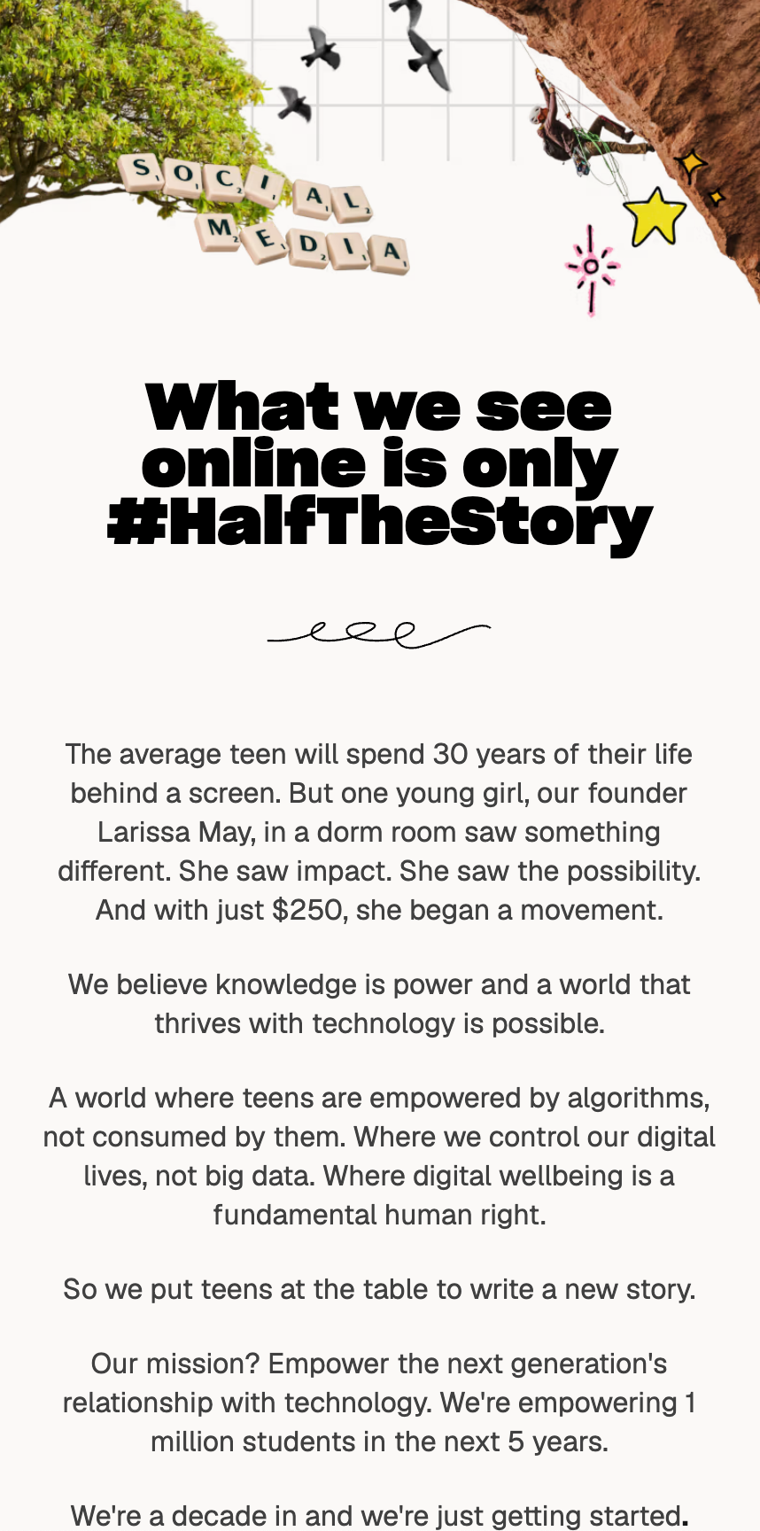
Pages are assembled from a library of modular sections rather than laid out by hand. This includes all hero blocks, program cards, statistics, article previews, testimonials, calls to action that you see on a typical page. When #HalfTheStory needed a Girls Inc. program page shortly after launch, it was assembled from existing blocks in about two hours, which is only feasible with a flexible modular system like this.
We later rolled out a system in the CMS for gated resources. Toolkit pages now offer downloadable material behind a short form, so the organization can put genuinely useful resources in front of educators, and also learn a little more about who needs them the most.


The site is built with Next.js and Sanity, deployed on Vercel, and it launched on September 10, 2025.
The #HalfTheStory team now has a site they can grow without breakages or a design brief, and one that helps users quickly graduate from interested to involved. The following year, this site became the foundation for their learning platform, in line with our philosophy of creating flexible sites that are built to last and grow over time.
Details
- Client
- #HalfTheStory
- Year
- 2025
- Work
- Web design, Information architecture, Web development, Content management systems, Custom CMS tooling