Intelligent websites harnessing responsive design
Your website is viewed on a huge variety of devices and screens. How can you ensure that it looks and performs great on every last one? The answer lies in responsive design.
Your website is viewed on a huge variety of devices and screens. How can you ensure that it looks and performs great on every last one? The answer lies in responsive design.
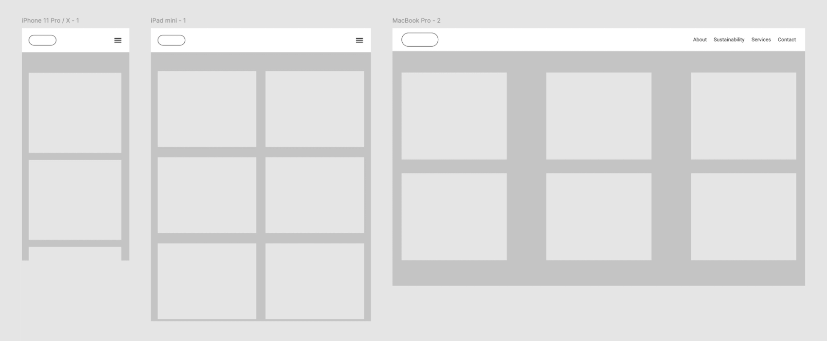
Modern websites pose a unique design challenge. How can a website’s user interface, images, and text be placed in such a way that the site looks great on desktops, tablets, and an endless variety of smartphone screens? For a period of time, site owners managed separate desktop and mobile sites, but if we’re being honest, a second website just adds another mallet to the headache. Thankfully, a solution to the problem has arrived, and it’s called responsive design.
Responsive design refers to web design which intelligently shifts based on screen size, the browser being used, and a myriad of other elements.
Many companies and individuals are still tied to unresponsive legacy websites. Why go responsive when all a user has to do is turn the phone sideways and scroll here-and-there and around-the-bend to find what they need? Our perspective on this ‘why’ question is … ‘why not?’ Your website represents you as a company or individual, and you deserve to look your best on all devices. Client retention depends on the small touches that you can offer your users, so it’s important to harness the technology at your disposal to provide them with great experiences! When we build a website from the ground-up at Field, we incorporate responsive design from the first step, so it’s part of your website’s essential structure.
Screen sizes aside, why worry about vigilant browser testing? After all, most people use Chrome these days, don’t they? While it’s true that Google enjoys a hefty market share in the browser world, it’s important to consider your users who might not use Chrome. Some people prefer Firefox, Edge, Opera, or even Internet Explorer! Every last person uses the internet differently, and regardless of personal preference, it’s our job as web designers and content creators to offer a smooth, high-quality web-browsing experience for as many people as possible.
Consider the classic phrase on ancient maps: ‘here be monsters.’ In our adventures in web design and content creation, devices and browsers are unknown factors, which can be daunting. However, the best solution to any unknown factor is preparation. That’s why at Field, we prepare each website to be lightweight, responsive, and tested on a gamut of screens and browsers, to ensure that each user can have a great experience on your site, regardless of their device or experience level.