
United Way ↗︎
2021–2023
Empowering community change through digital experiences


Since 2021
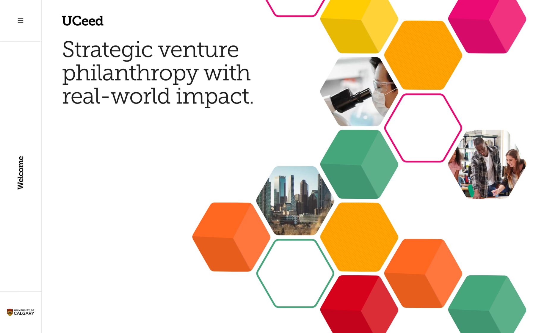
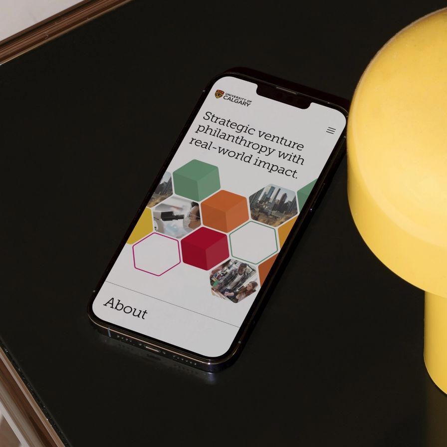
The University of Calgary's UCeed initiative is a venture capital program backed by philanthropic funding, providing venture capital to startups through early-stage investment funds. Explaining this unique funding model to prospective investors and fund contributors isn’t straightforward, so Built by Field was brought in to design and build a website to communicate the value of this work.


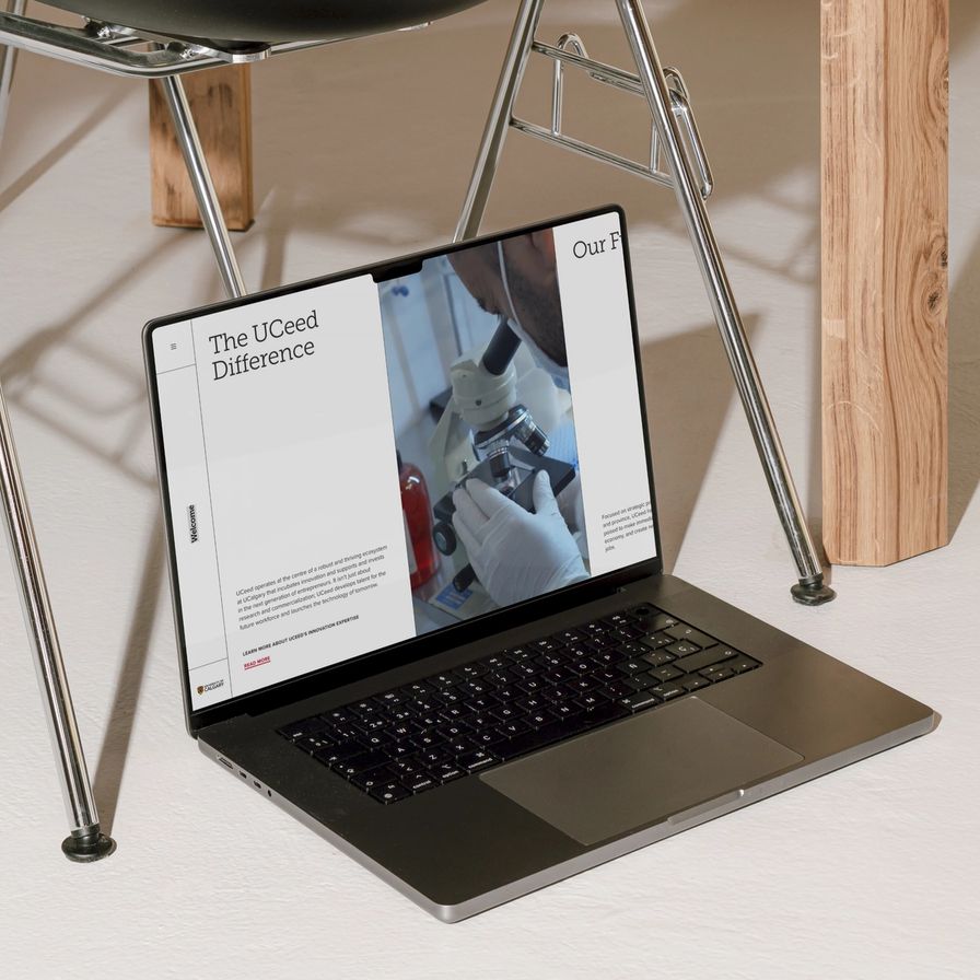

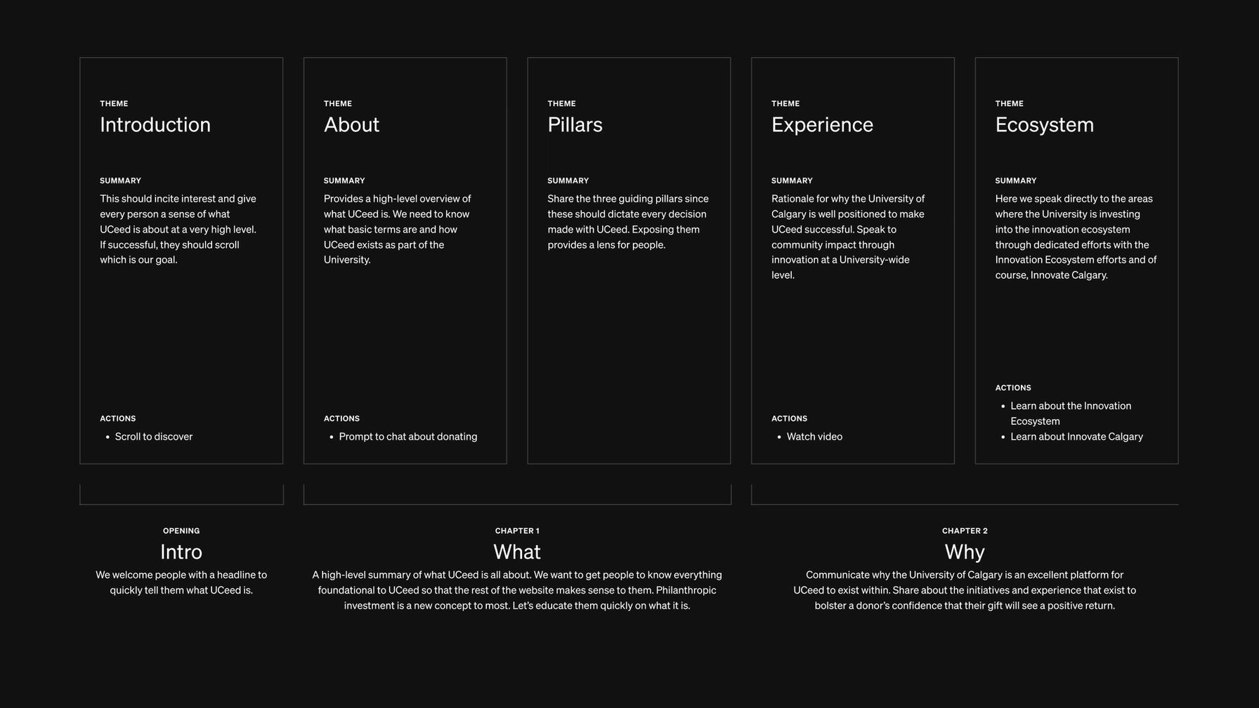
We needed to take prospective donors through UCeed’s story in sequence, so we structured the site to mirror that conversation. Content is organized into chapters, each developing one part of the UCeed proposition before moving onward. The pacing moves visitors through the initiative's purpose, its mechanism, and its outcomes in an order that earns comprehension before asking for commitment.


Prismic was selected as the CMS, giving the University of Calgary's team direct control over content as the portfolio grows and the story evolves without requiring development work each time a change needs to be made.
UCeed’s site tells the story of a program that provides startups with capital, equipment, and expert access, a story that can be hard to tell in a cohesive way, and it makes the story legible and engaging.

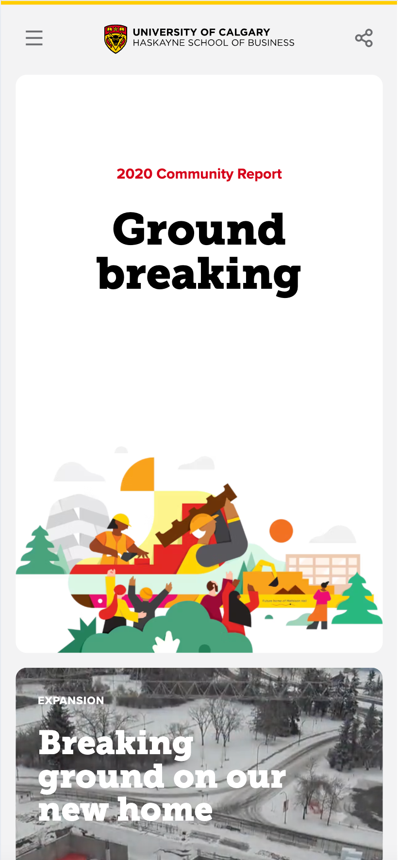


For their 2021 Annual Report, Haskayne School of Business’s team approached us with a challenge: they wanted to find a way to deliver their year-end story in a format that stakeholders would explore, not just skim.


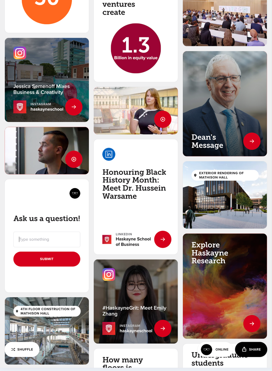
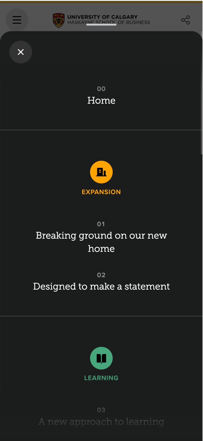
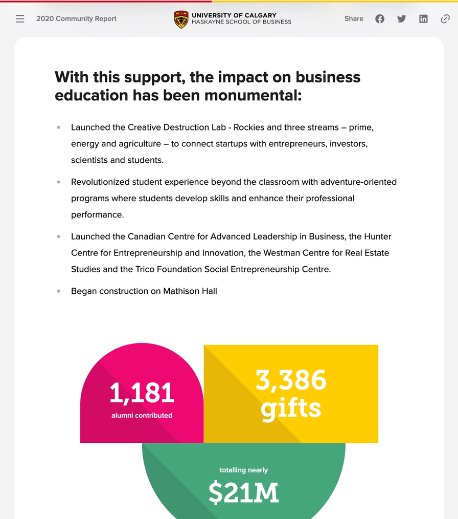
The volume of information wasn't an issue, as Haskayne’s content was well-organized and high quality. Working with the Haskayne team, we built their 2021 Annual Report as a web-based experience organized around a gallery-style layout, where content lives in discrete, visually distinct cards rather than continuous scrolling prose. Readers get an overview of the full report at a glance, then move into whichever areas are relevant to them. The structure respects that faculty members and prospective donors aren’t reading the report for the same reasons.


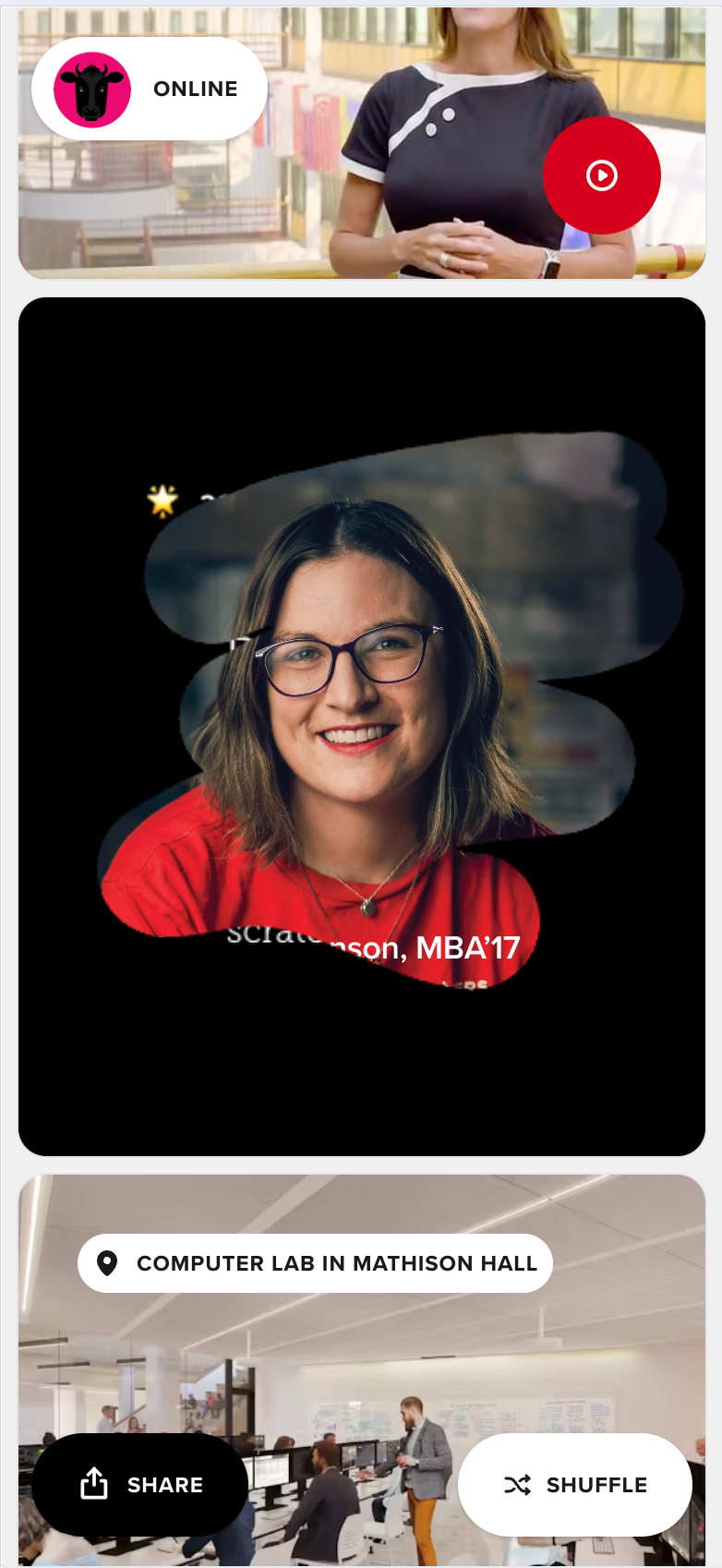


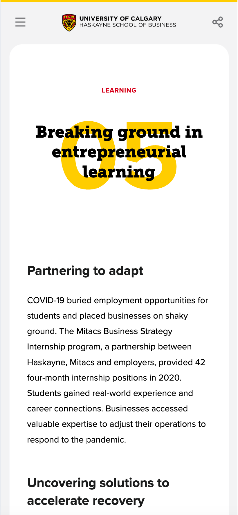
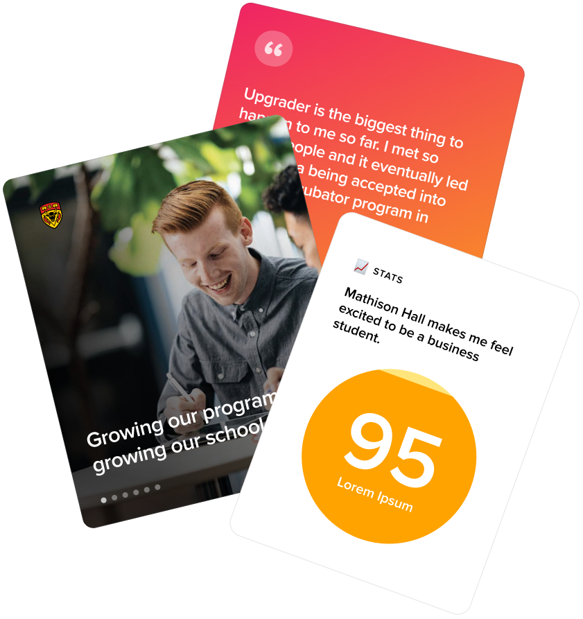
To keep the card-based experience from getting repetitive, we developed several card types, each suited to a different kind of content, including an interactive illustration card and a scratch-card mechanic that rewarded readers who engaged with it. Each type was designed to match the nature of its content, so the form and content stayed in step with each other throughout.
Typography, color, and layout were held closely to Haskayne's brand standards, though each card type retained its own visual character within that system.
The site launched in 2021, and served as a great example of reporting conveyed with coherence, without appearing too flat.
Empowering community change through digital experiences


Providing a step up for everyone through education

Elevating education technology through strategic digital transformation


