It’s been seven months and a metric tonne of candlesticks, but we’re finally here. Strata Capital Partners’ website is live at stratacap.ca, and we’re really proud of it.
When we first sat down with Ryan, Jordan and Fariba last October, they told us that they wanted their new site to capture a feeling of sophistication and trustworthiness without pretension, like a mountain acreage or a Volvo, as opposed to the high-rises and Lamborghinis promised by their competitors. They’d designed a logo already, but needed to capture that specific feeling with their brand and replace their old website, which wasn’t cutting the mustard for them.

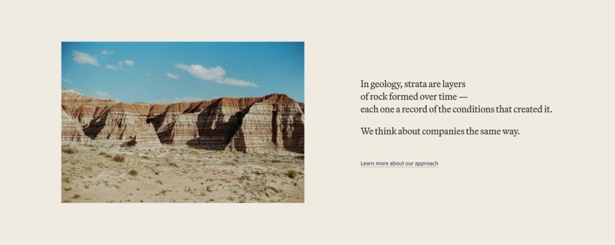
The site is full of images of sedimentary rock, reflecting Strata's purpose in a very literal sense. We also wanted Strata’s visuals to reflect their philosophy of building wealth in layers for the long-term, so we used the familiar shape of candlestick charts as a design element, creating layered patterns resembling sediment.

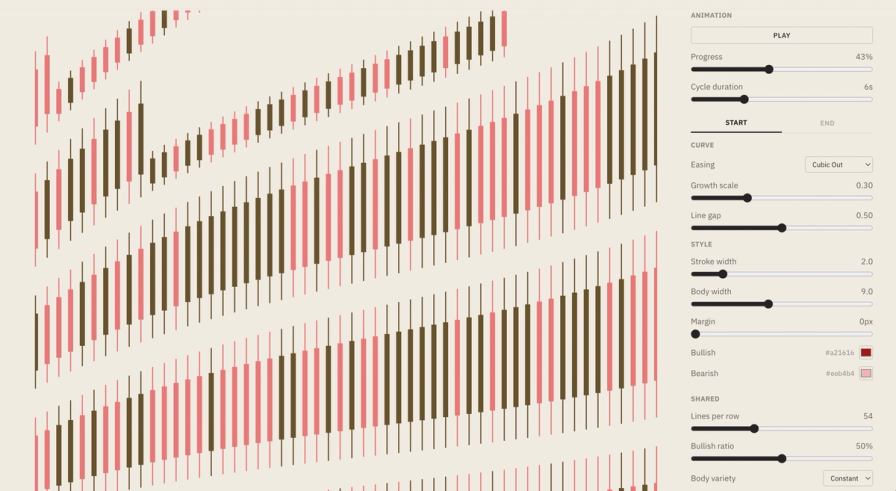
Getting these candlesticks right drove our team just the right amount of crazy, with Jesse even building a custom tool for generating these patterns as images and animations.
Typography is Martina Plantijn paired with IBM Plex Sans, replacing the old site’s Times New Roman and Montserrat.

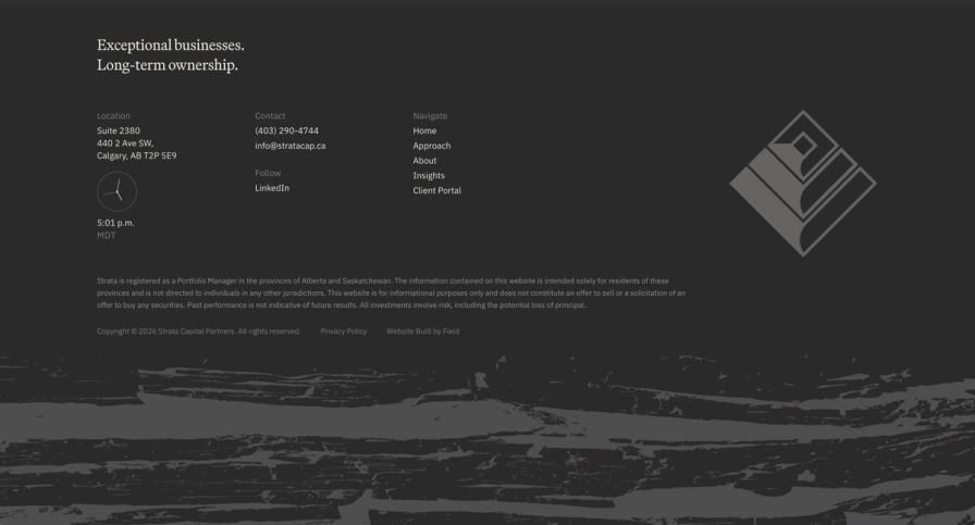
We’re quite fond of the site’s footer, with its ticking clock and layered stone texture.
The site went live on May 11, 2026. We’re proud to have built something unique with Strata’s team, and are glad to put something out into the world that looks like their firm instead of the paint-by-numbers financial site template you’d typically see. Check them out at stratacap.ca.